When the clients were building their custom home, they had an idea for a clean and bright kitchen but weren’t sure how to bring it to life.
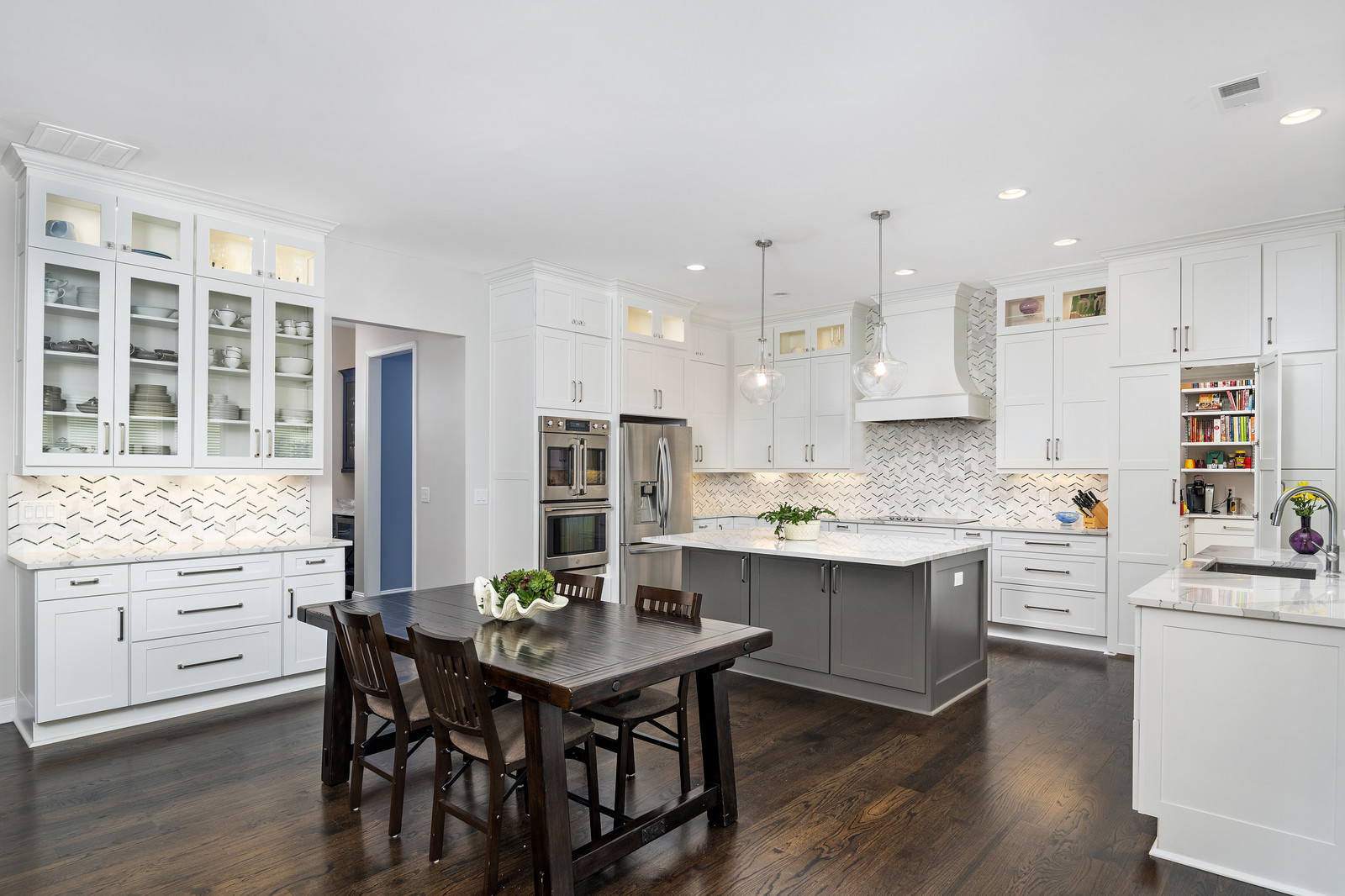
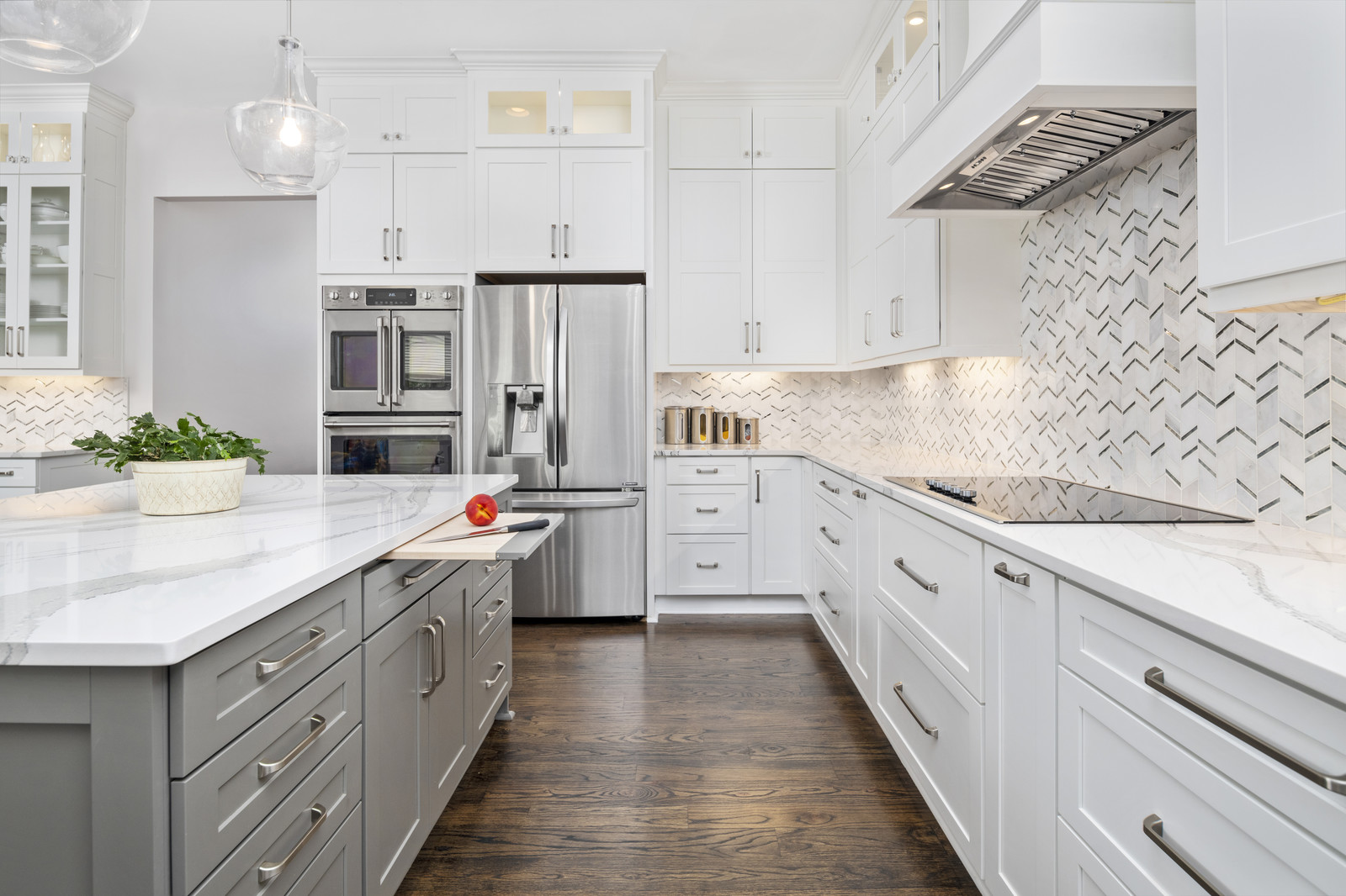
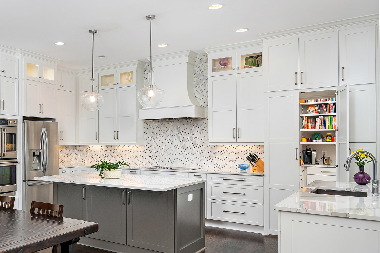
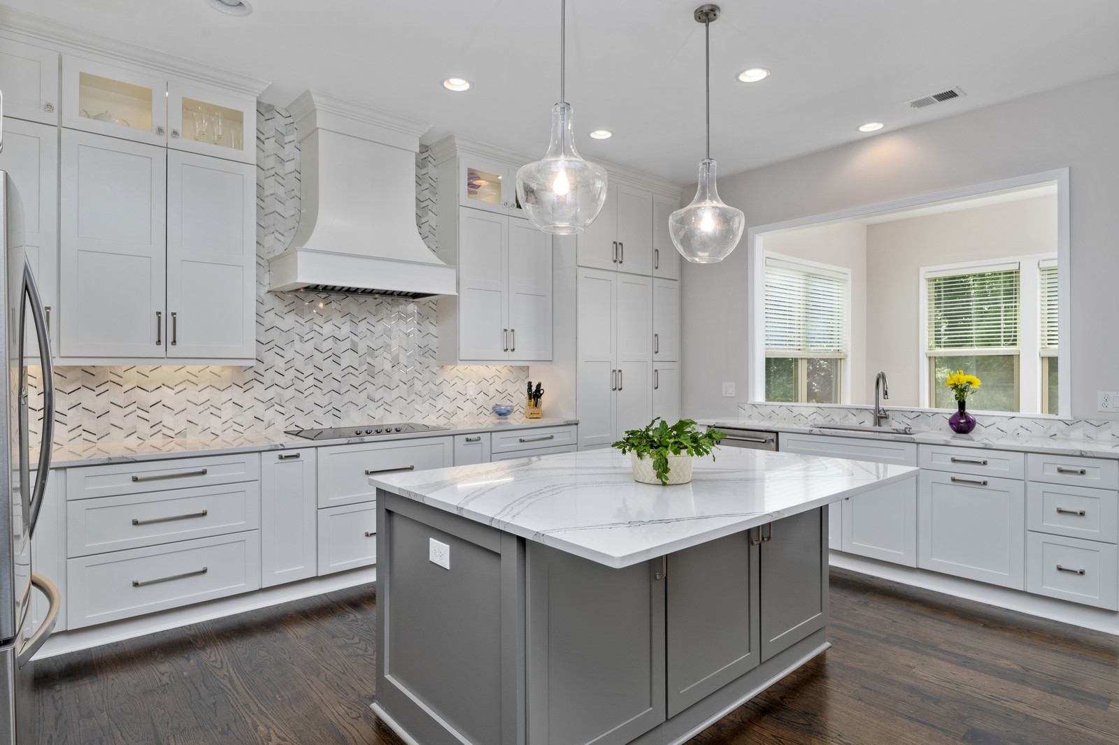
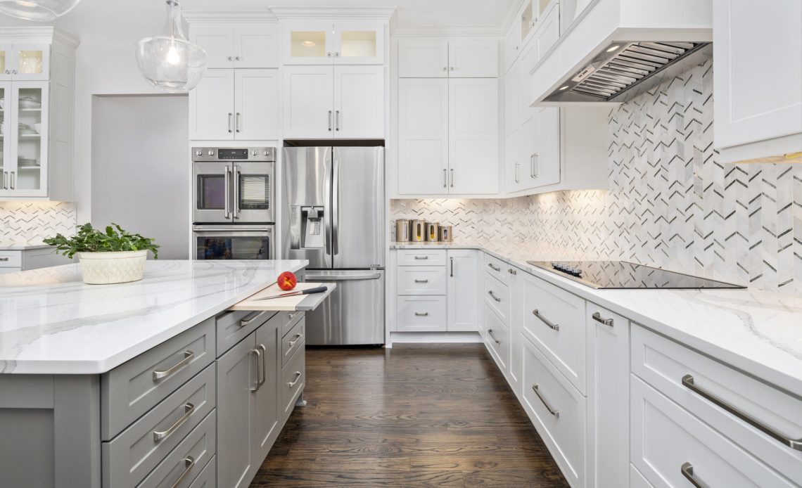
Since the space has no direct windows, we opted for a light and bright design with floor to ceiling white shaker cabinetry from Showplace. We took the cabinets to the ceiling with double stacked 54” wall cabinets featuring backlight glass inserts on some of the uppers. We mirrored this look on the bar cabinets and opted for glass doors to showcase the dishware. To keep the space from feeling flat, we went with a painted gray island to break up all the white.

One of the best and unique features of the space is the walk thru pantry.

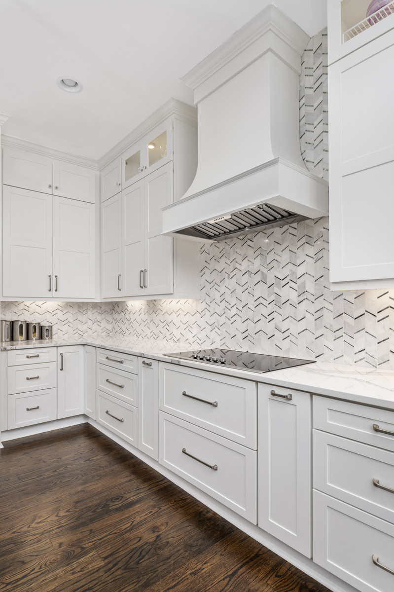
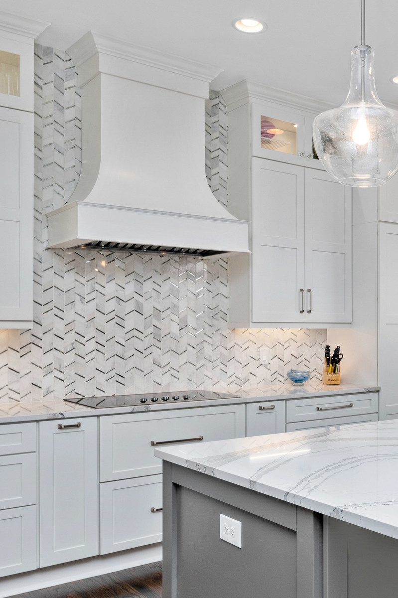
For the backsplash tile we wanted to break up the all-white and do something more than a standard subway tile. We chose a marble mosaic in a herringbone pattern. The variation of colors add depth and intrigue to the space that wouldn’t be there if we went with a simple subway. After deciding on the gorgeous flared hood we decided to extend the backsplash to the ceiling to enhance the shape of the hood.


The marble looking quartz from Cambria helped bring all the pieces together and tie in the gray from the island and backsplash. The light quartz helps keep the space soft while providing intriguing lines through the gray veins. The final touches come from the satin nickel pulls and glass pendant lights that finish the space.
The overall look is a beautiful white kitchen that is anything but boring.
