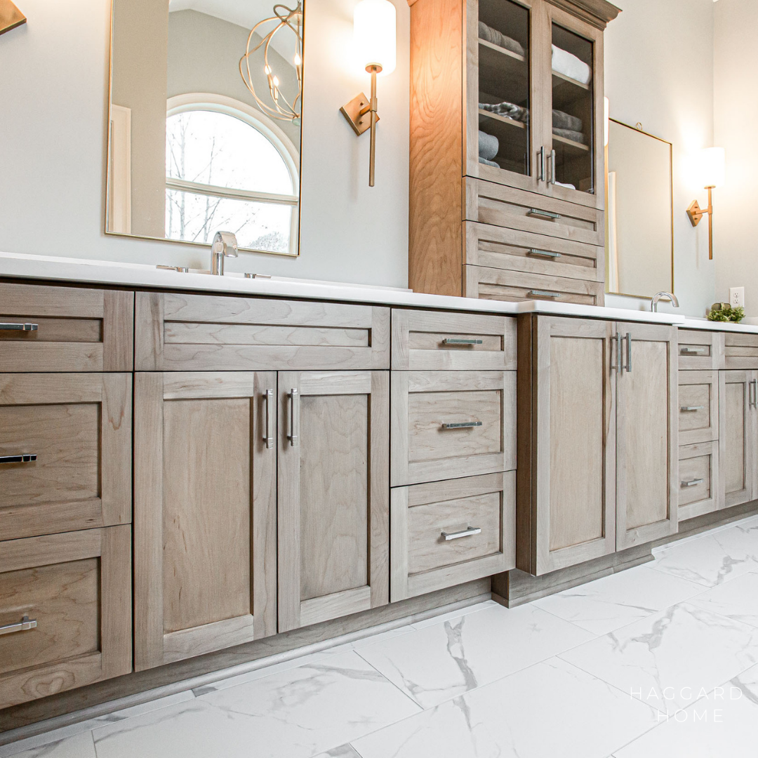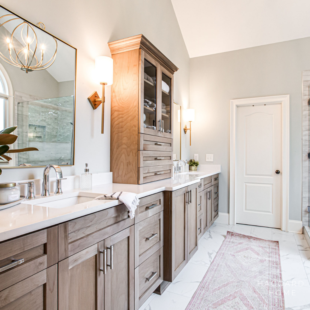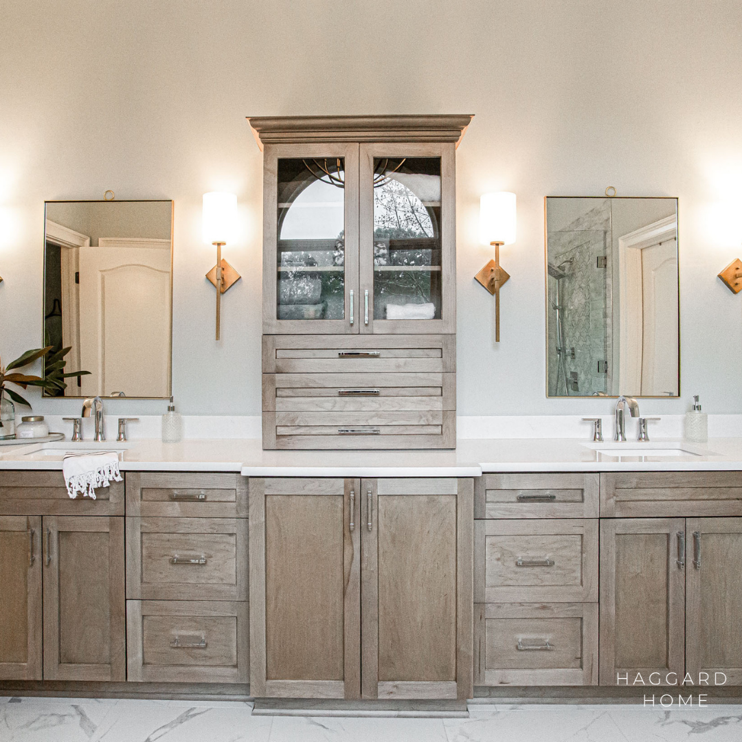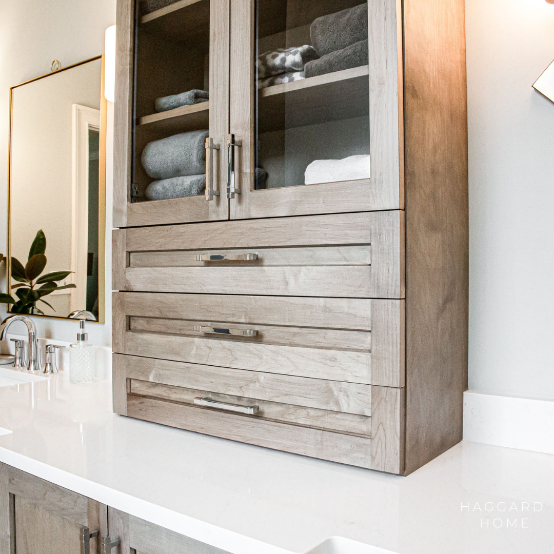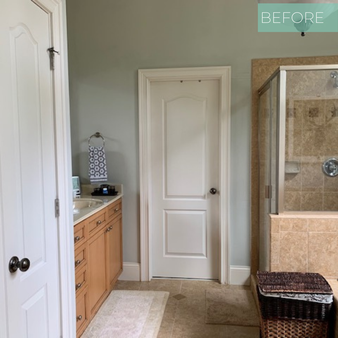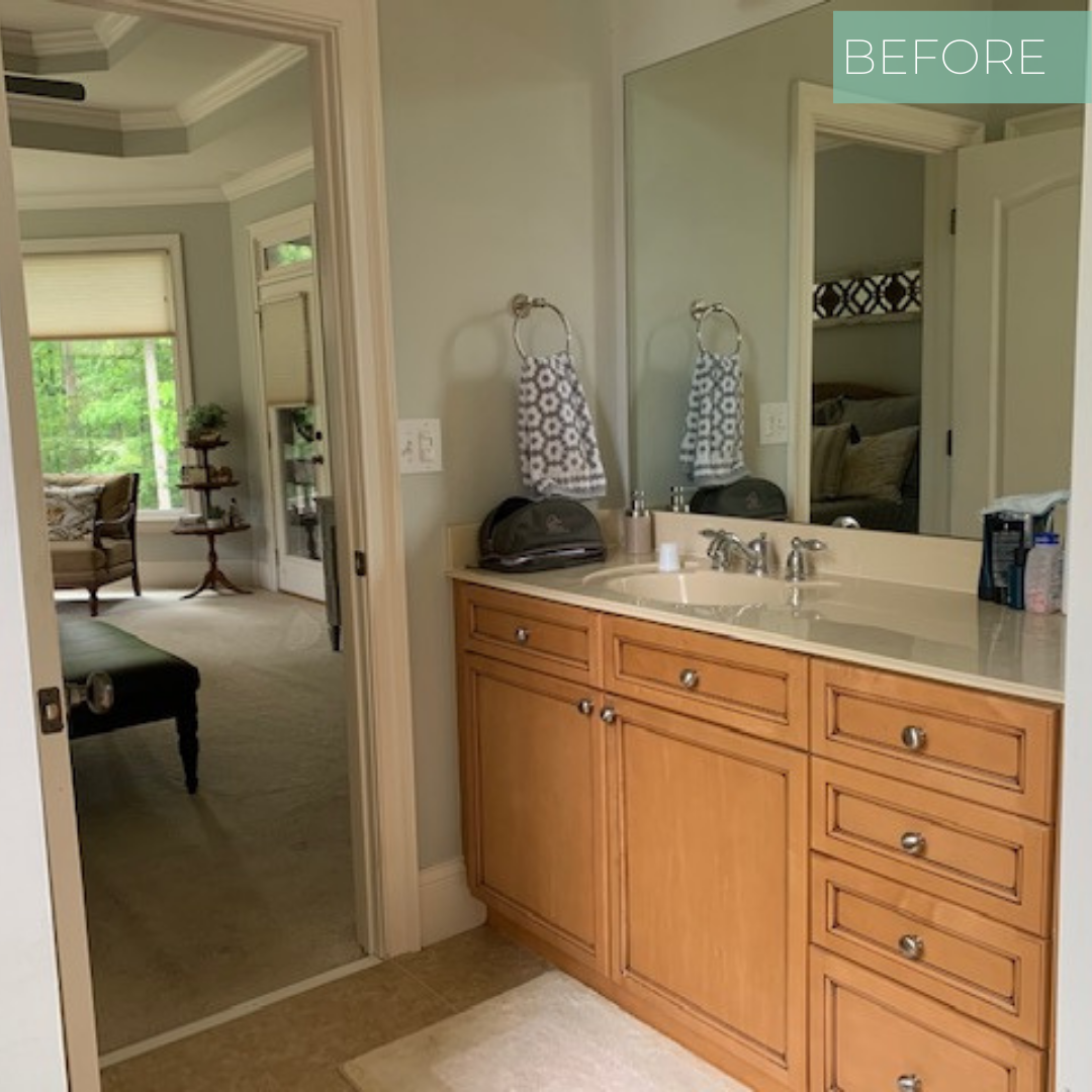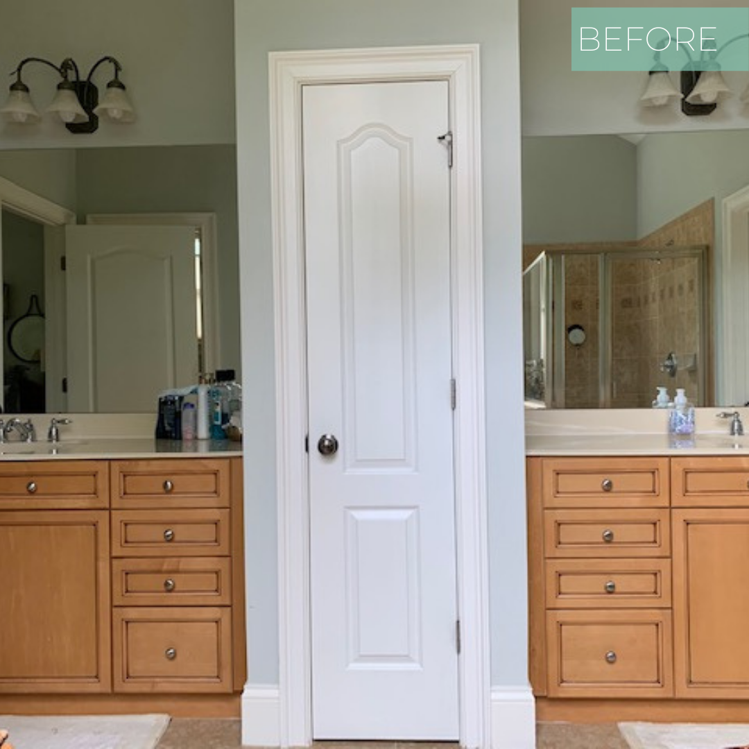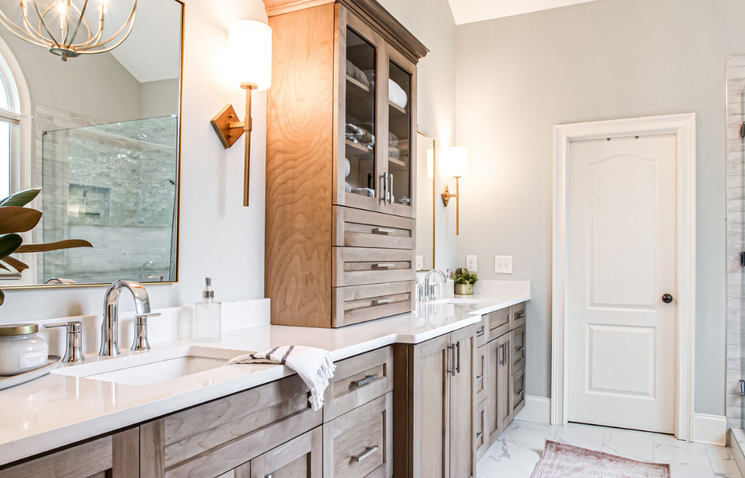
During our initial meeting with the client we knew she wanted something different while staying timeless. As a VP at her work she wanted a spa like place to relax and unwind after a busy day. Her bathroom was long and narrow but she wanted it to feel more open. One of the biggest changes we made was removing the small linen closet separating the vanities. To make up for the loss of linen space we added a glass door wall cabinet- the perfect spot for her linens. This helped break up the space of the vanities to keep it from feeling like a giant long row of cabinets.
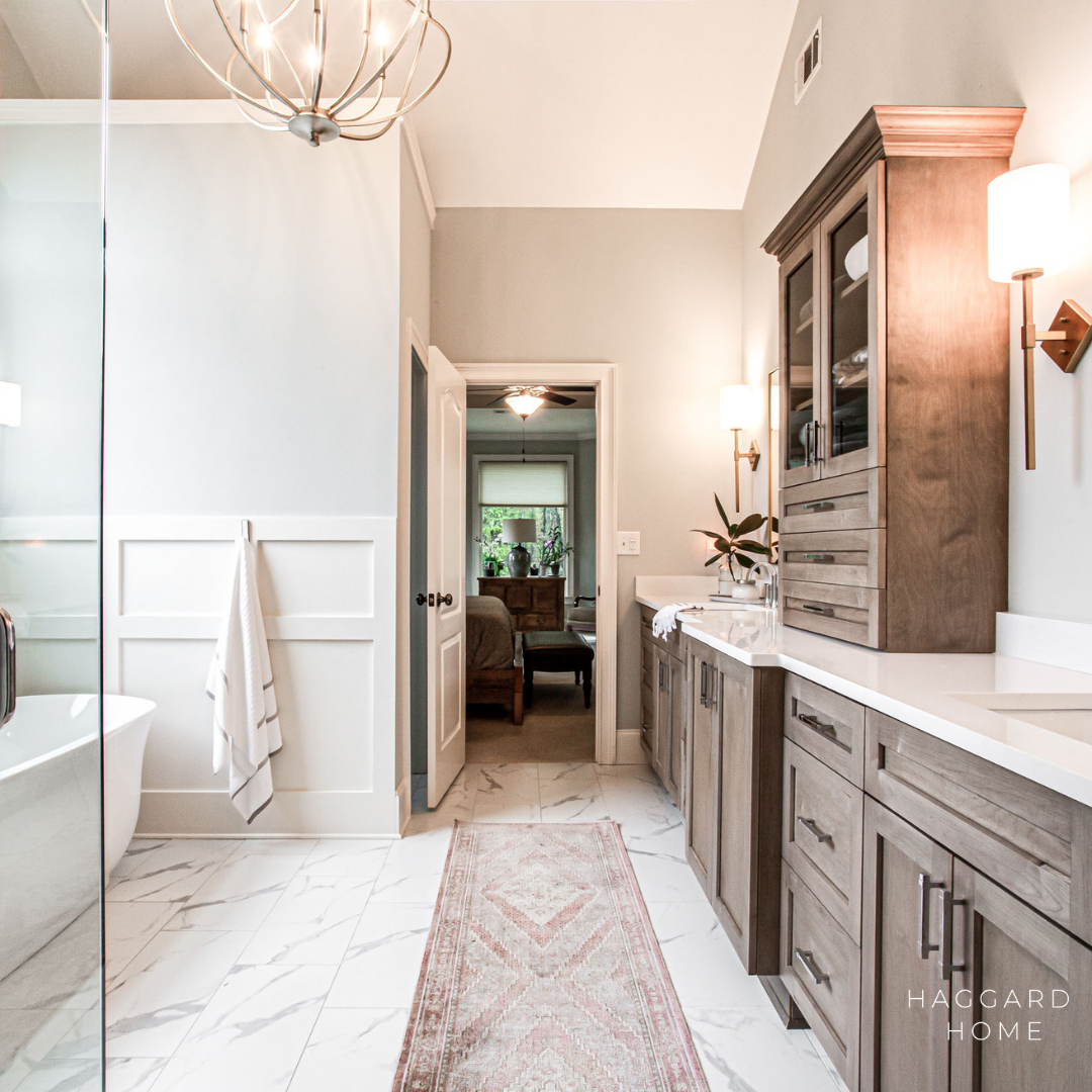
The client wanted it light and bright and was originally was thinking of going with white cabinets but trusted us when we said going with a beautiful warm wood tone would help bring warmth and depth to the space, and we are so glad she listened!

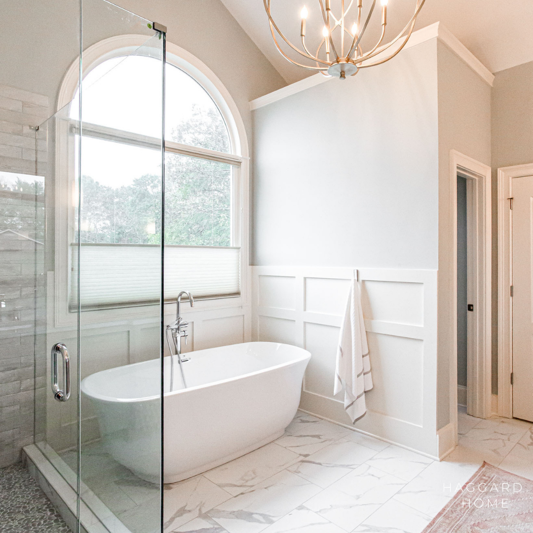

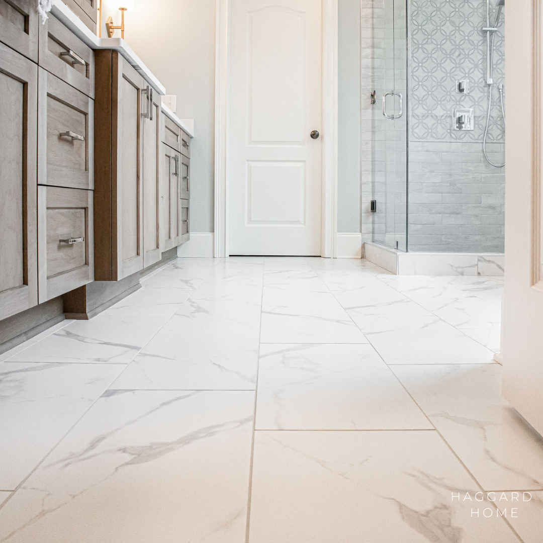
To keep the space light and bright we went with marble looking porcelain tiles for the floors and marble subway tiles in the shower. To keep the space more traditional we opted for a wainscot behind the tub but went with a more modern design.

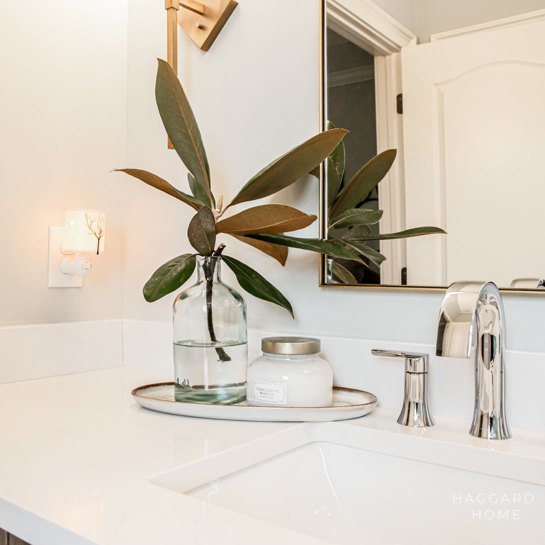
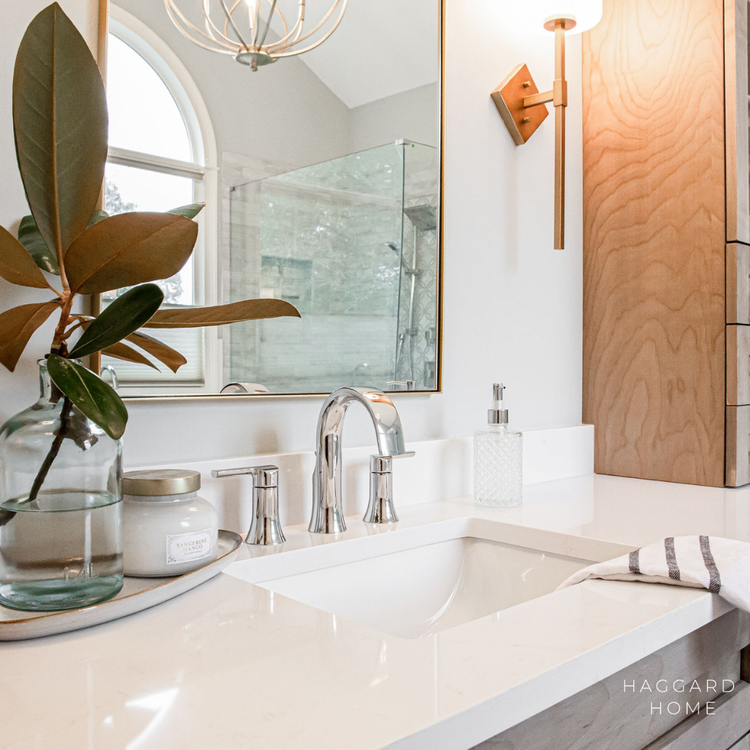
The gold mirrors and light fixtures add the perfect amount of pizzazz and warmth

The polished nickel fixtures and cabinet hardware add a soft touch, while the gold mirror and light fixtures add the perfect amount of wow.
Scroll through and tell us your favorite part below
Here are the before’s
Sources:
Hardware | Jeffrey Alexander
Wall Sconces | Shades of Light
Floor Tile |MSI
Countertop | Silestone
Design by: Brittany Varela | Haggard Home Cabinetry & Design
Cabinets by: Haggard Home Cabinetry & Design
