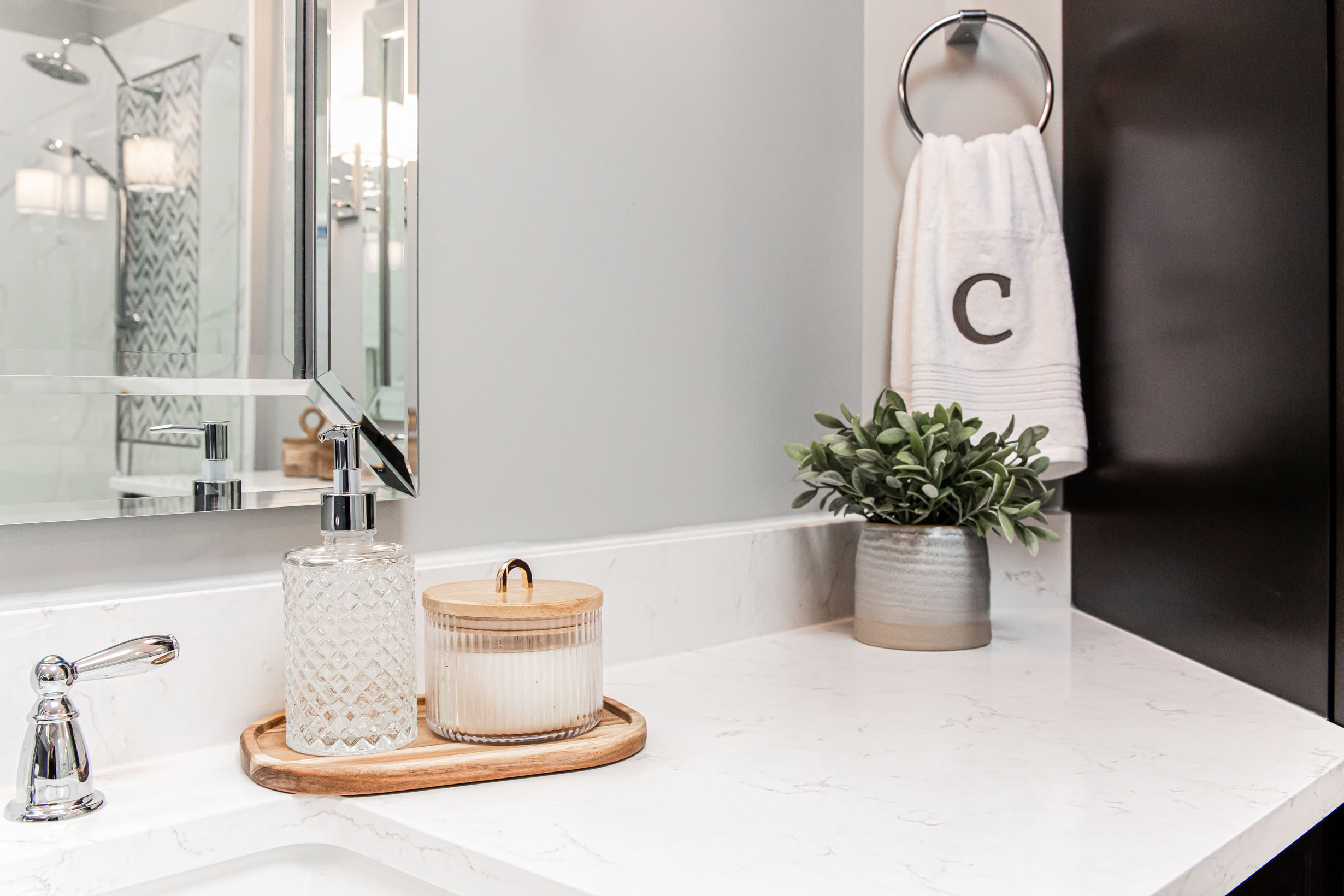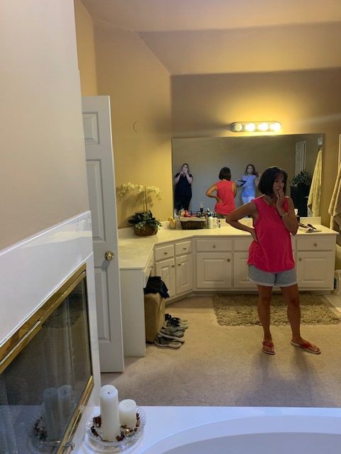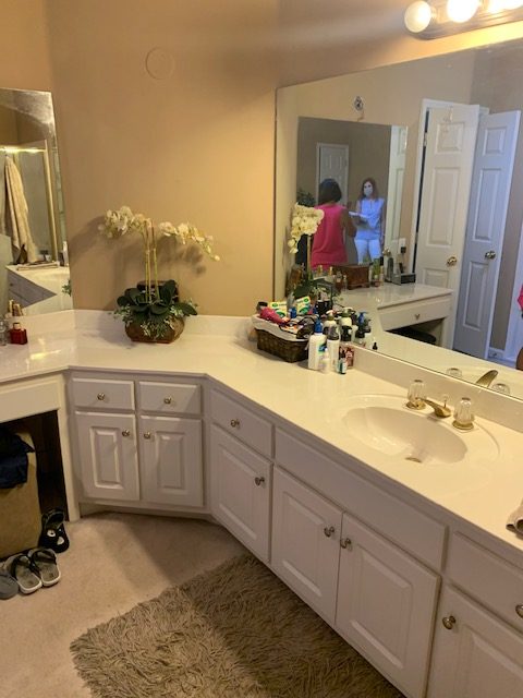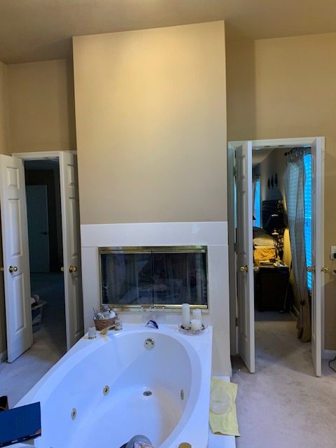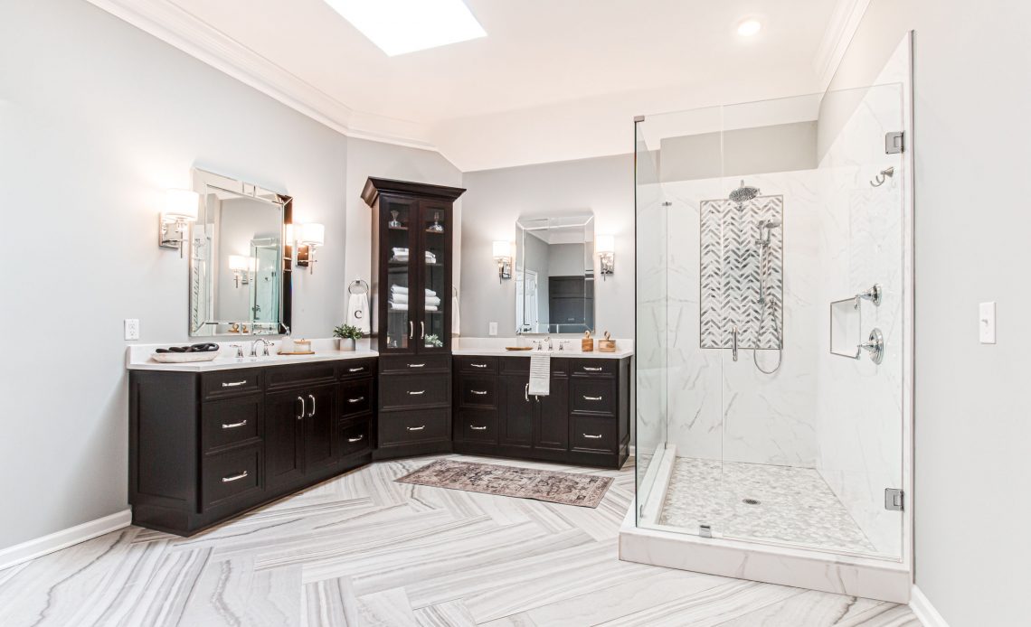
When our clients purchased this house they loved everything about it except the master bathroom. The bathroom was dated and a giant waste of space with an oddly located fireplace and unusual vanity placement. She didn’t know how she could make the layout work, but she did know she wanted drama– not classic white bathroom for her.
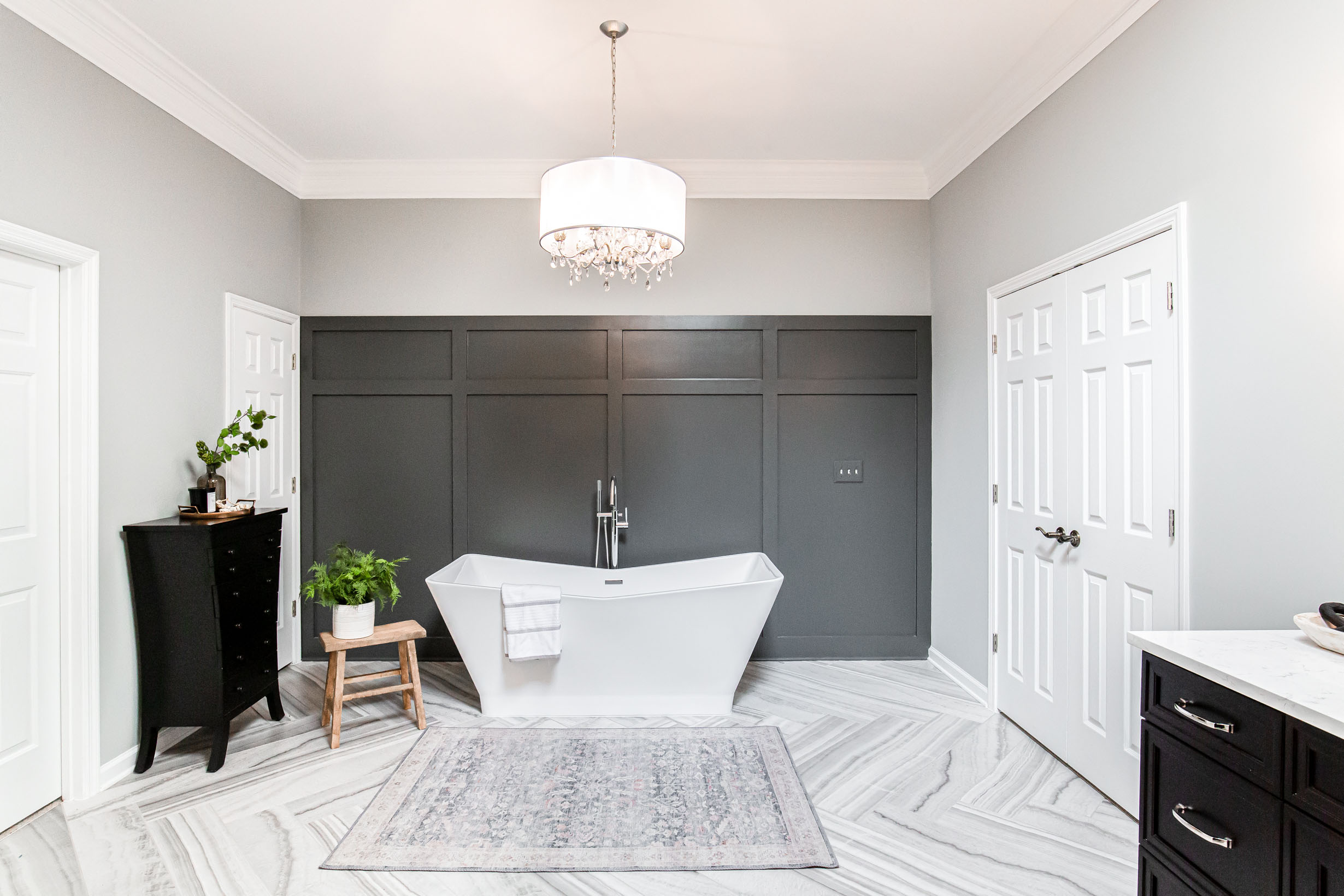
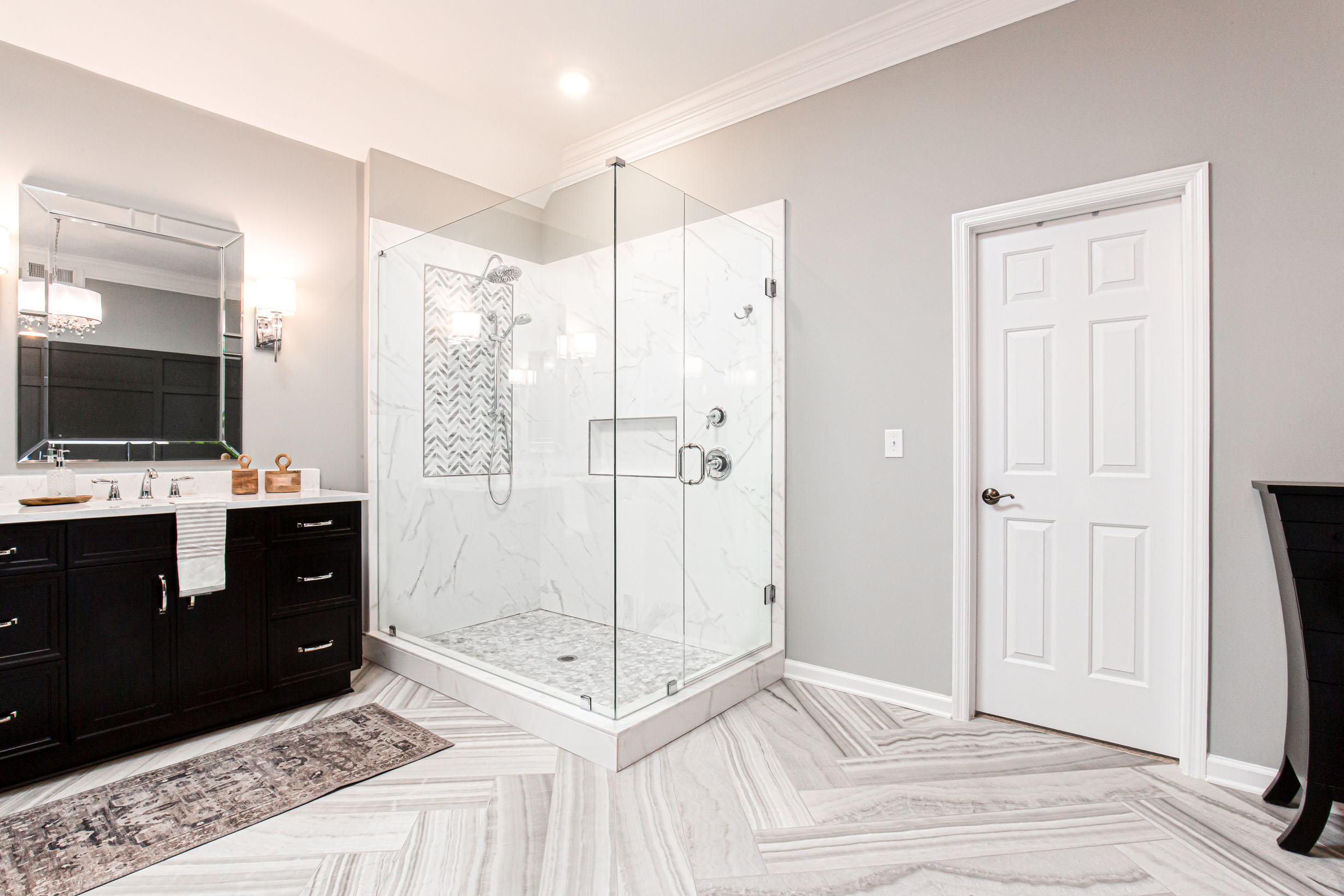
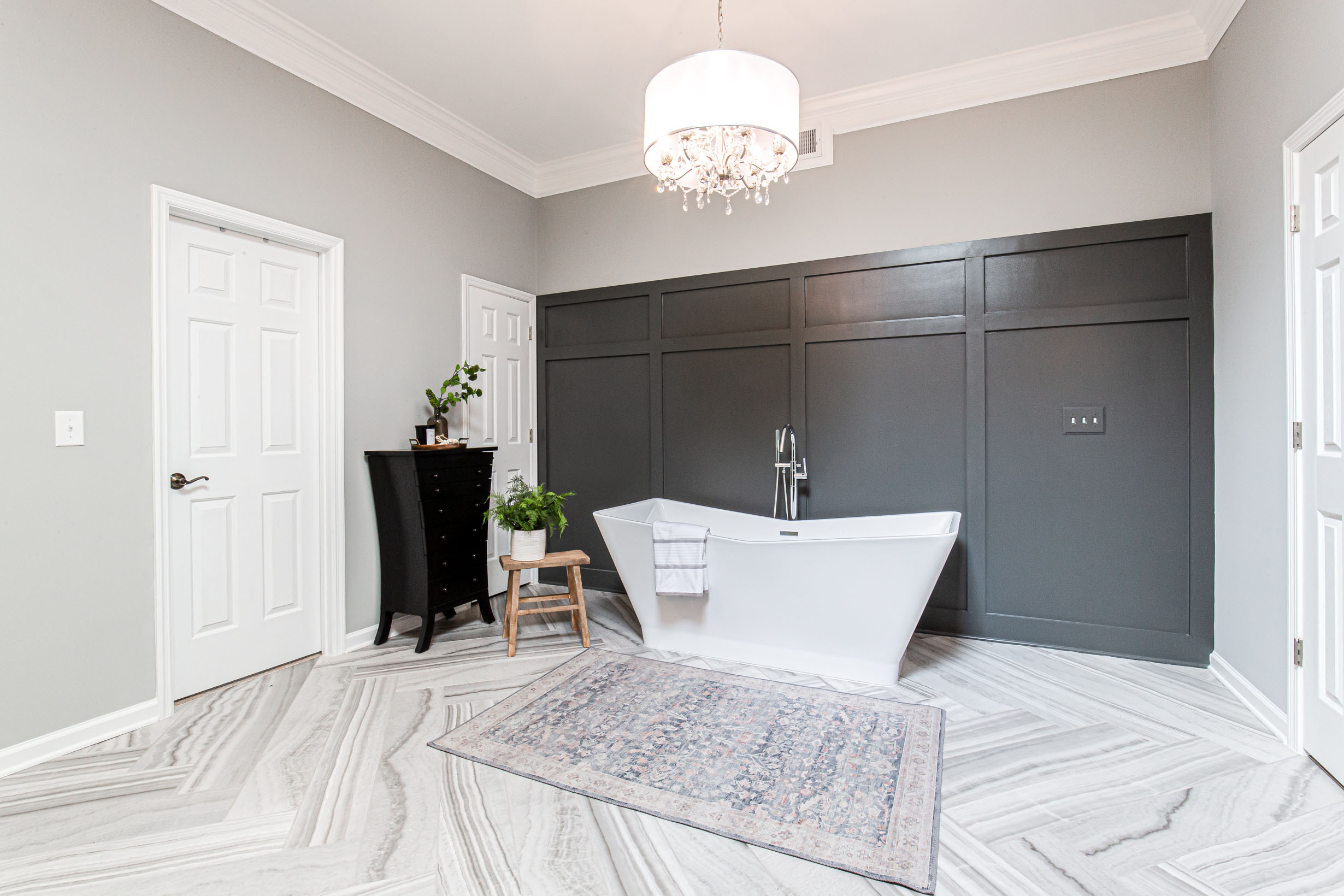
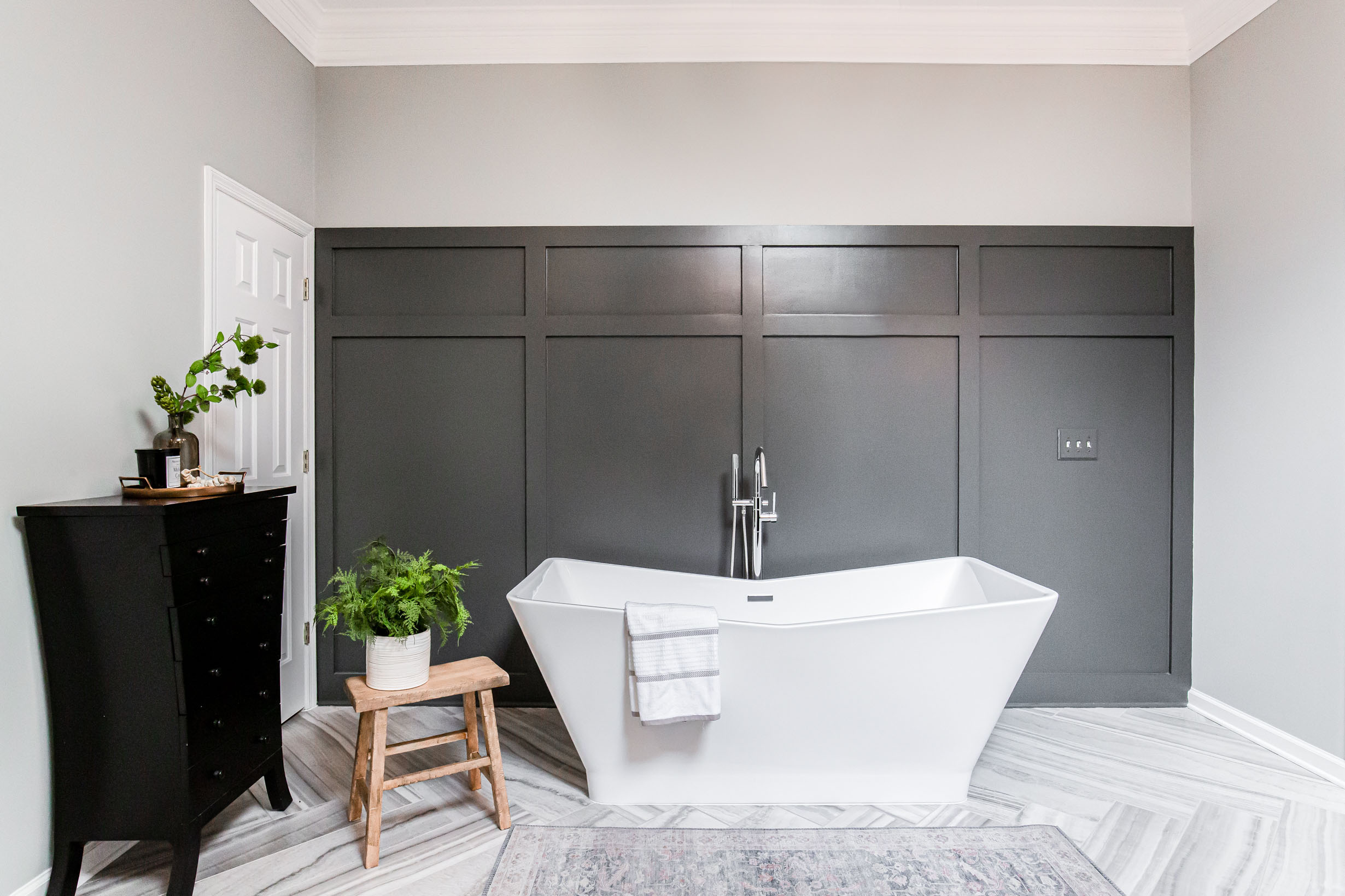
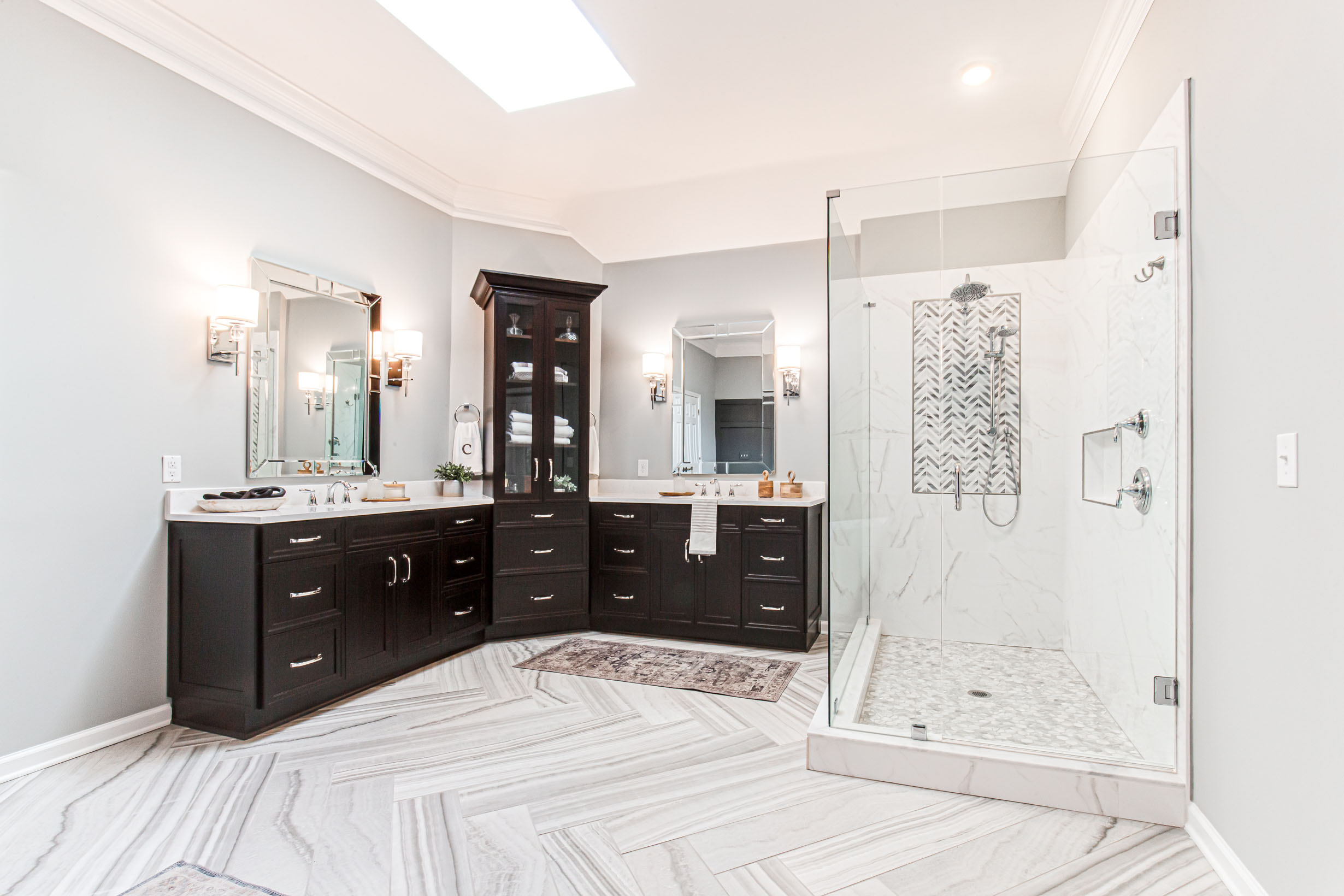
Since she had no desire for the fireplace and wanted a larger entrance we removed the dated tub. To help fill out the space where the tub was located we opted for a show stopping tile laid in a herringbone pattern.
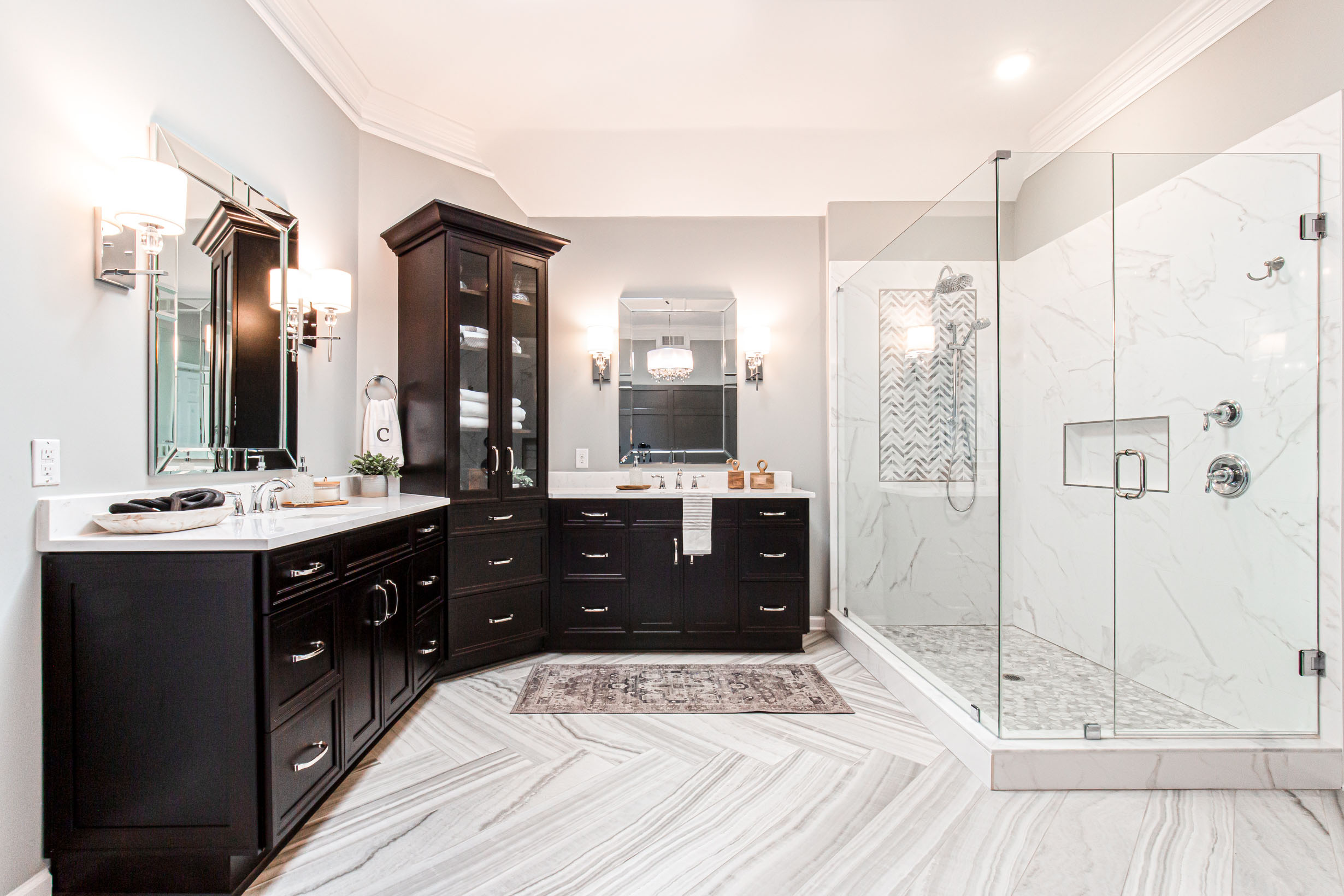
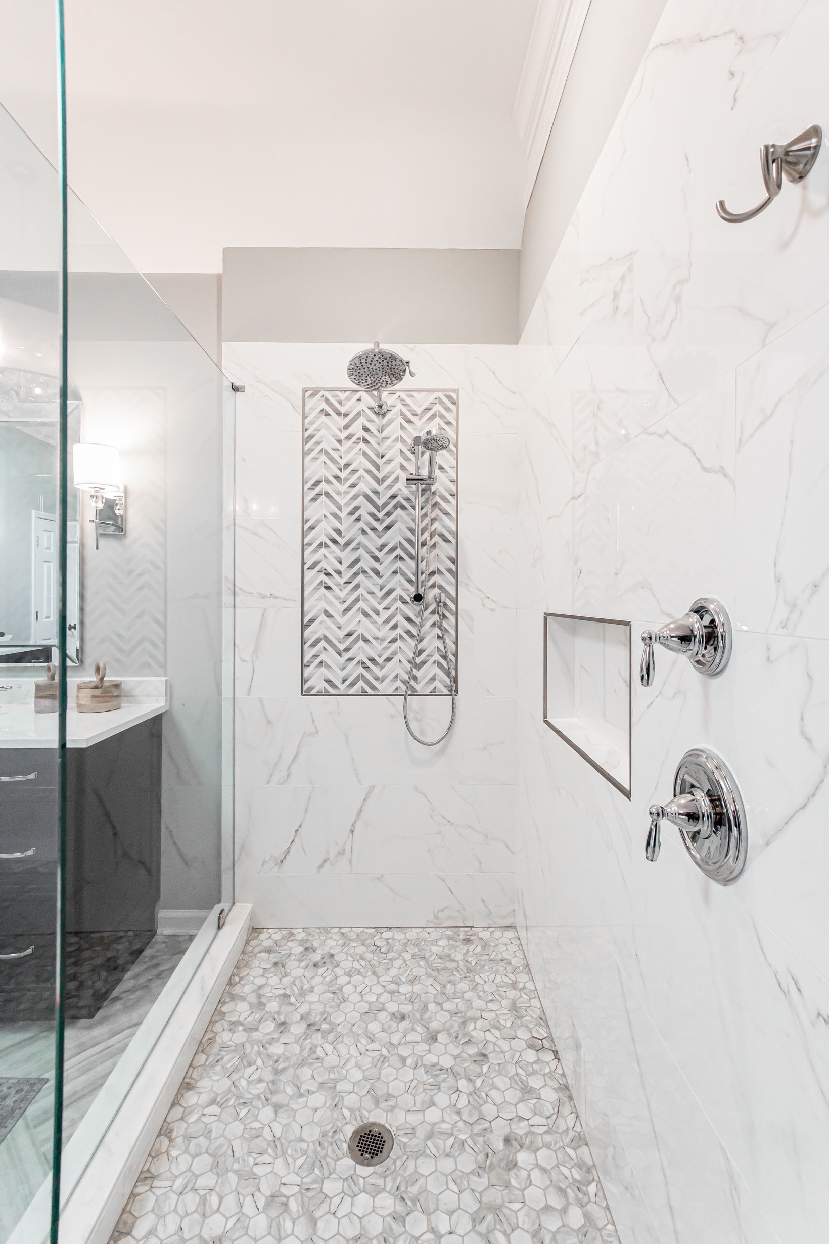
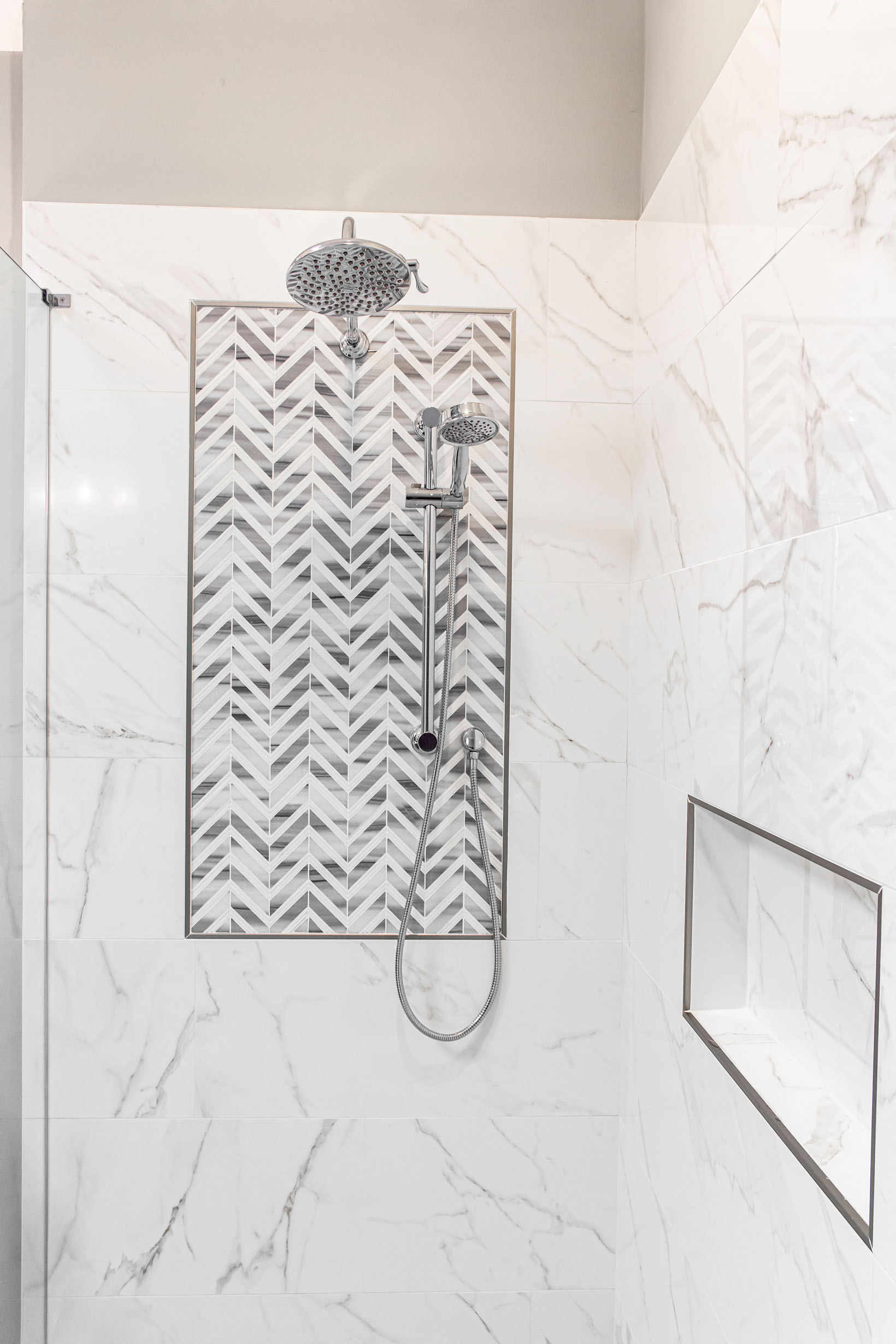
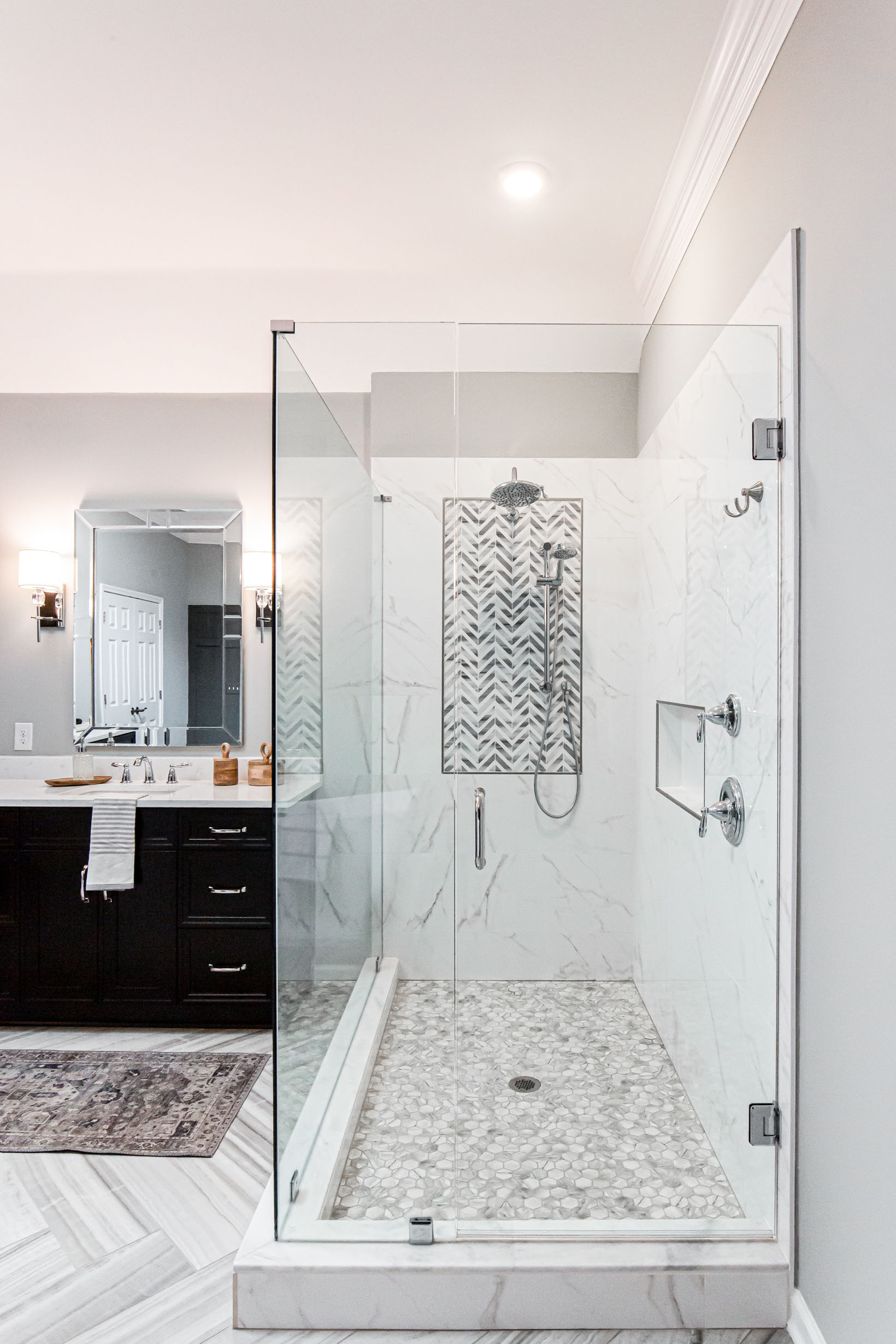
For the shower we opted for large format porcelain tiles and a large accent feature to draw the eye.
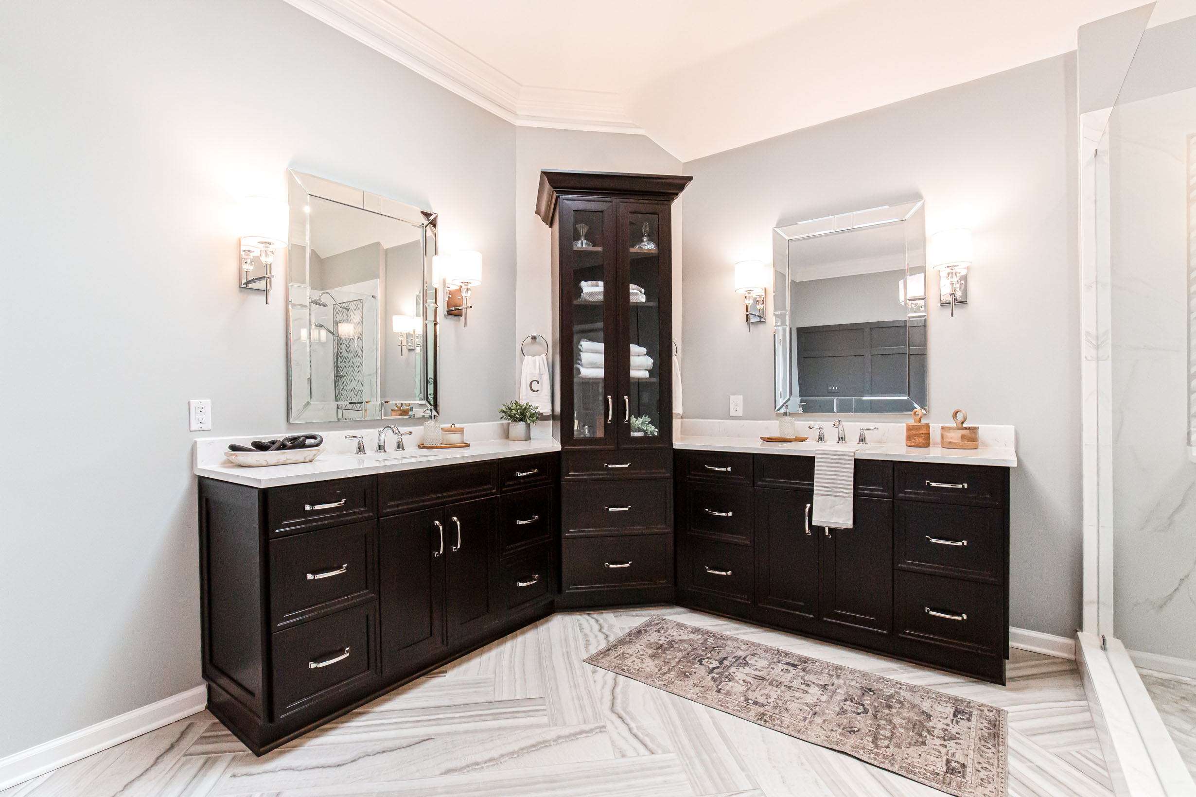
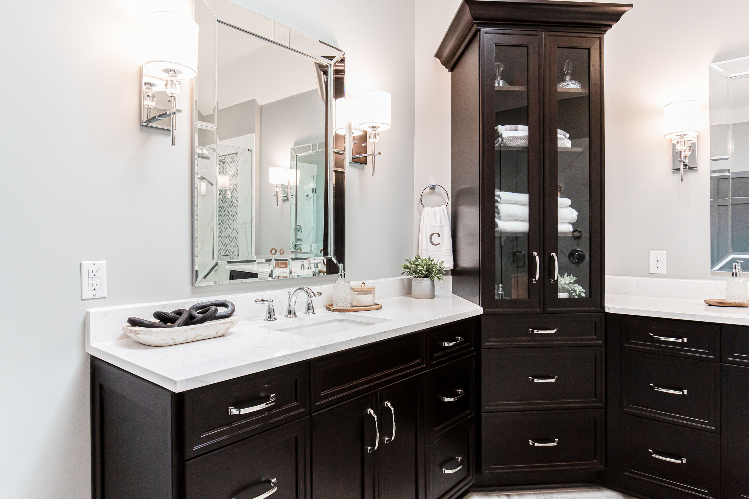
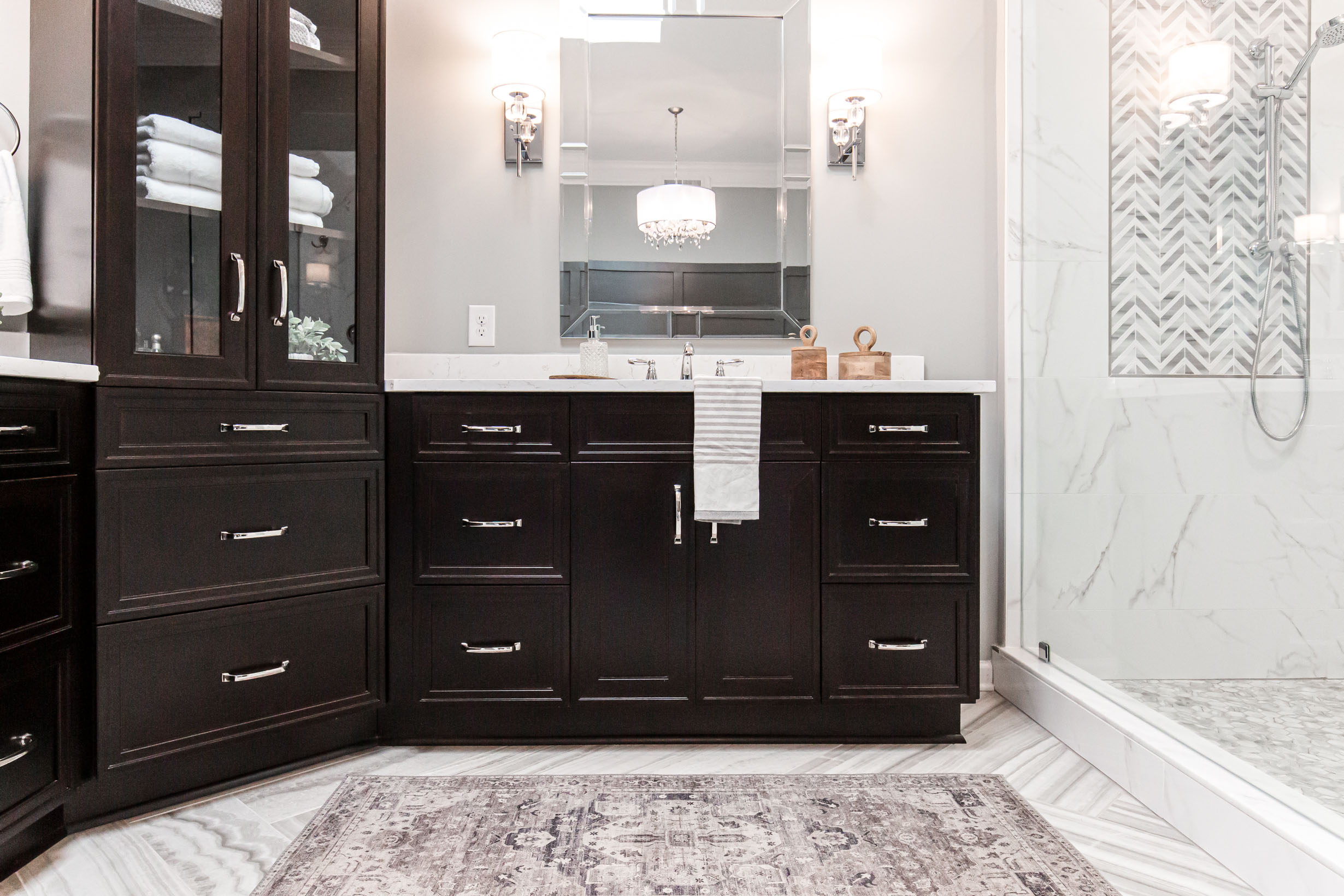
To help anchor the space and give the room some weight, we went with Kith cabinets in a java finish. The black was the perfect accent for all the polished nickel finishes and beaded glass wall sconces.

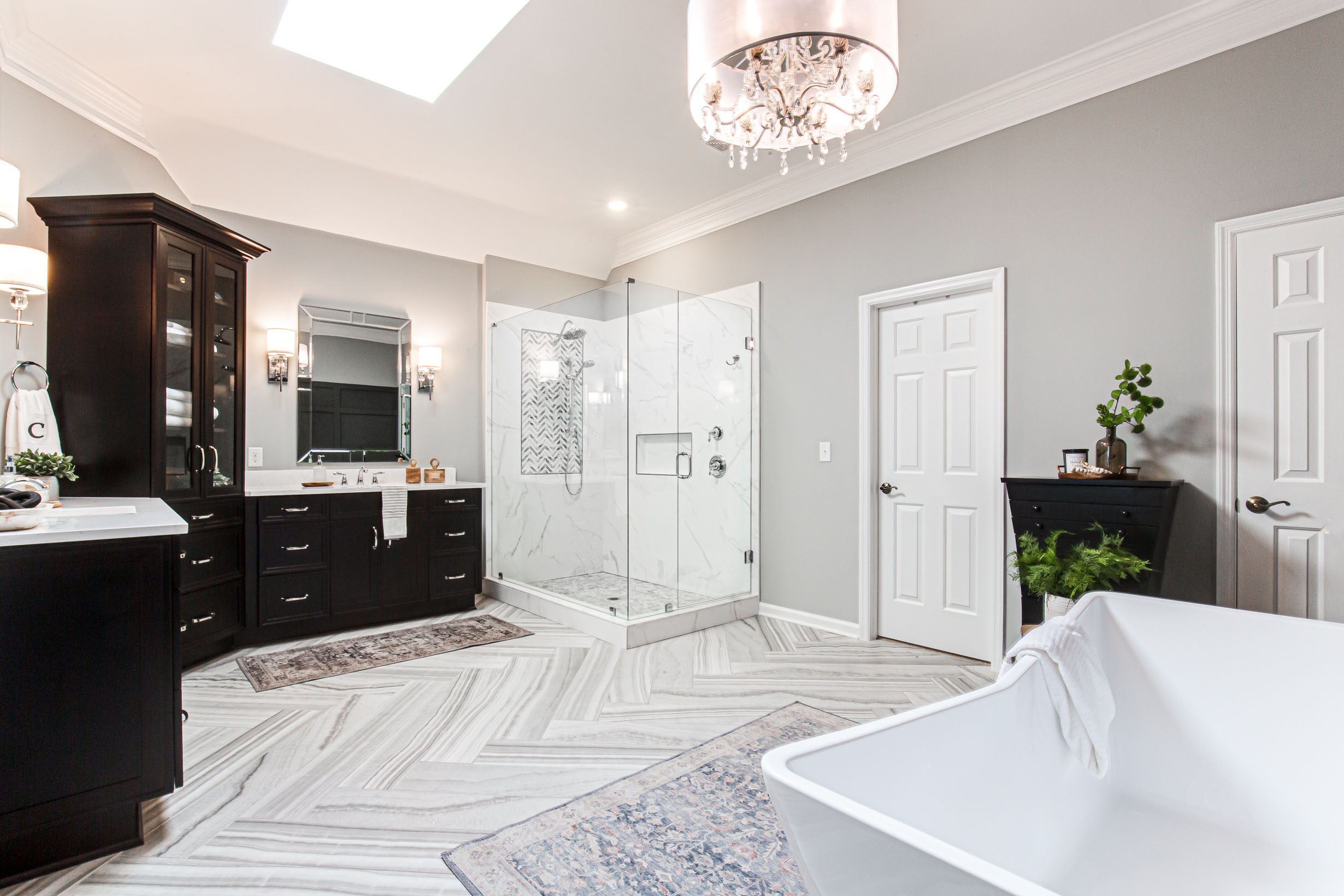
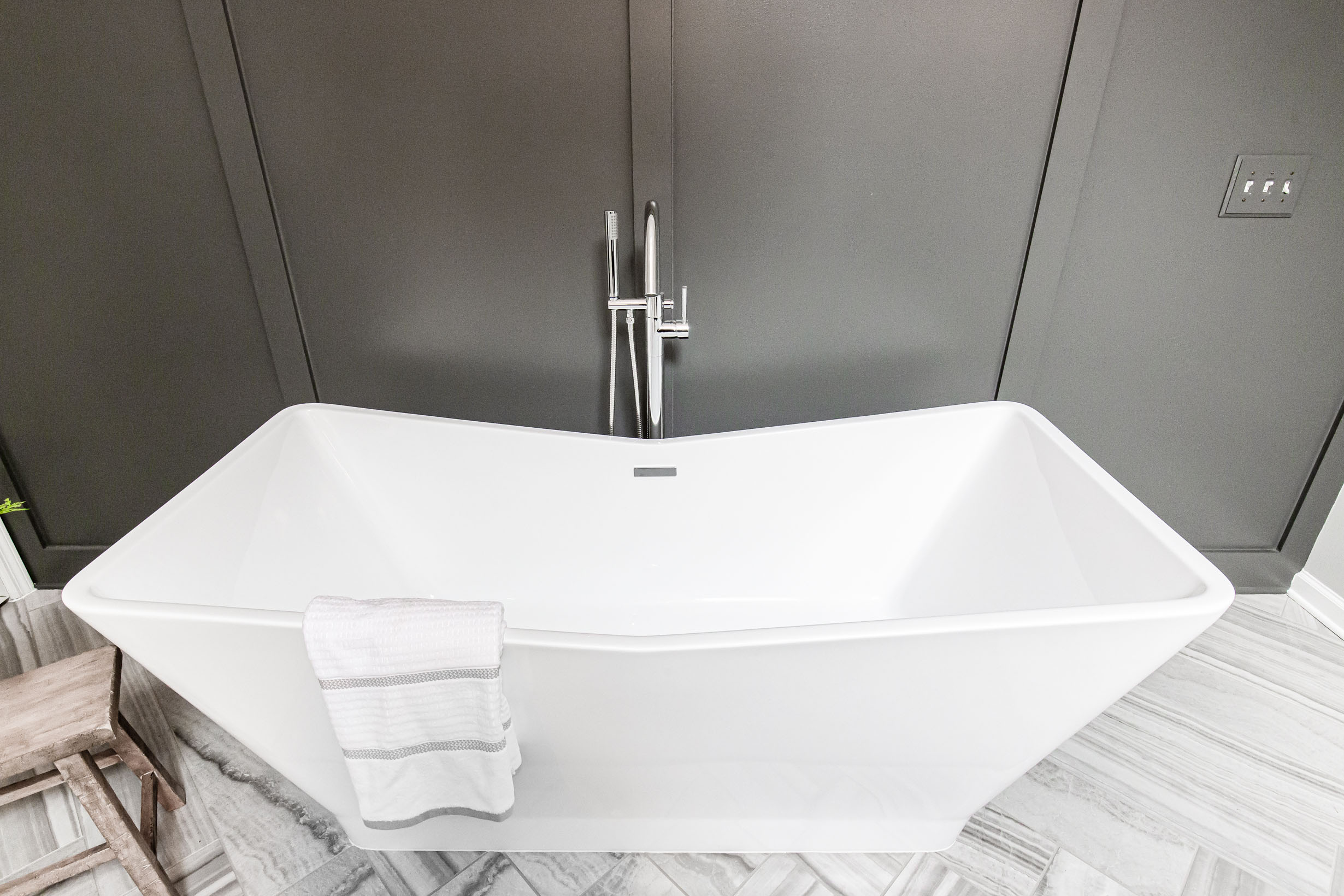
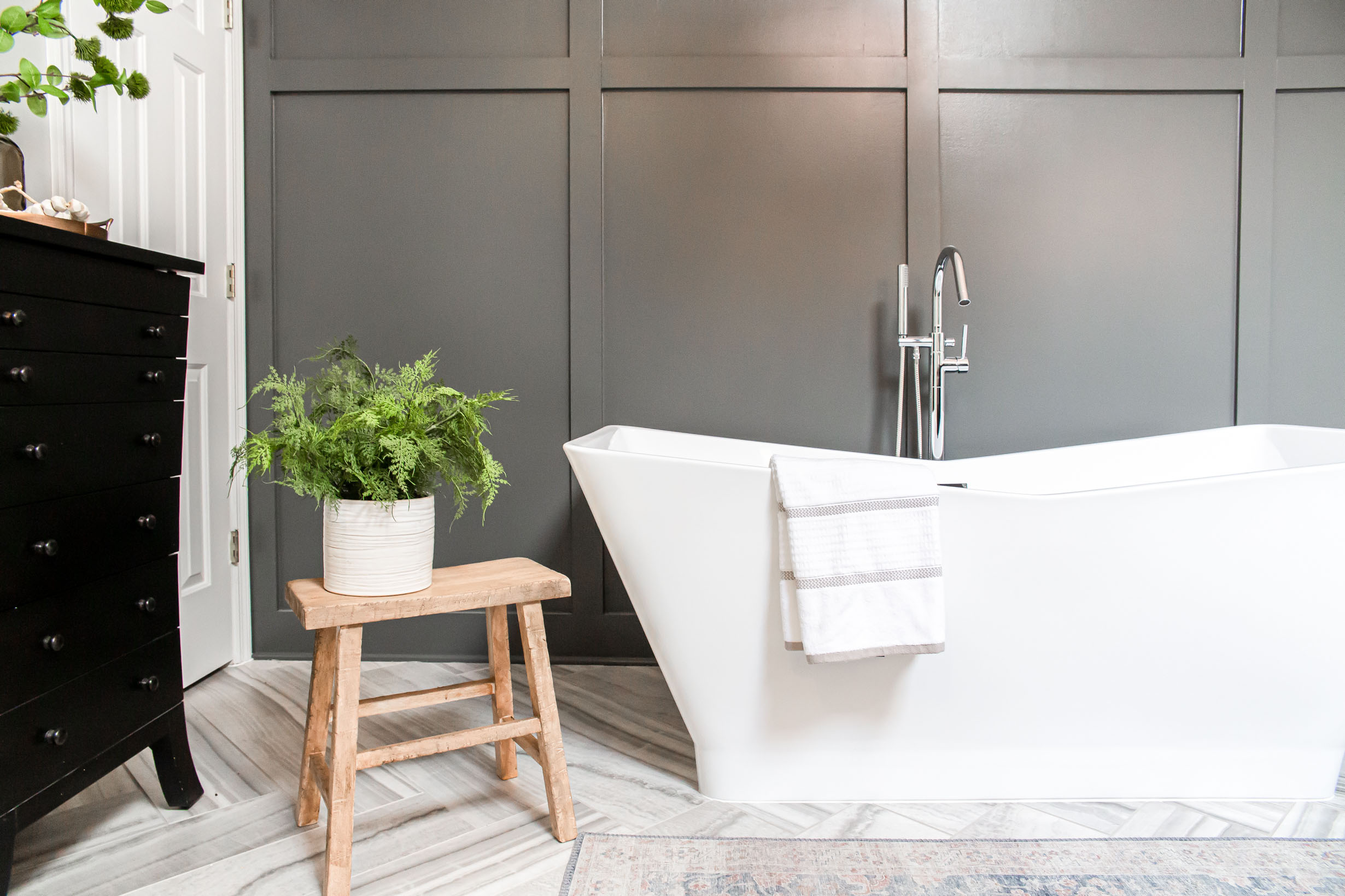
To make the tub feel like a statement we went with a fun shaped free-standing tub, dark accent wall and crystal chandelier. The perfect mix of finishes for this space.
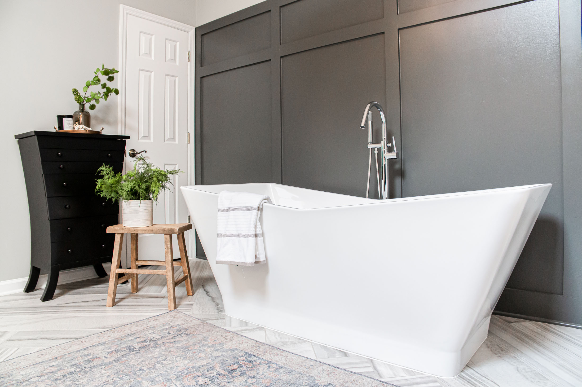
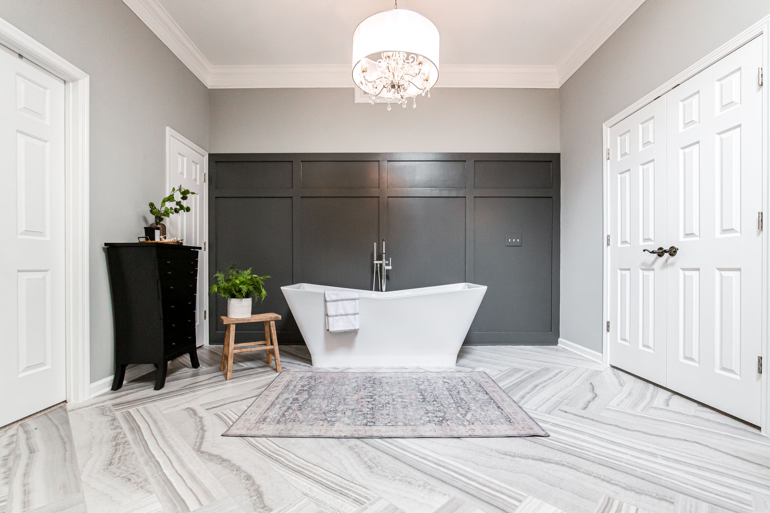
The beautiful tile in the herringbone pattern was the perfect starting point for this design.”
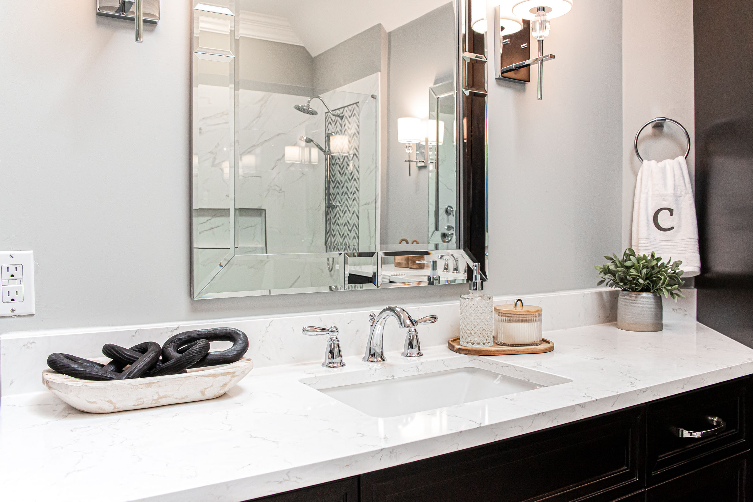

Scroll through and tell us your favorite part below
Here are the before’s:
Sources:
Countertop | LG Viatera
Wall Color| Sherwin Williams Argos
Accent Wall Color |Sherwin Williams Grizzle Gray
Chandelier | Lamp’s Plus
Wall Sconces | Progress Lighting
Hardware | Amerock
Shower Wall Tile | Precious 18×36
Floor Tile | Happy Floors Onyx Silver
Accent Tile | Soho Studios
Shower Floor Tile | Glazzio Mayan Garden
Grout Color: Mapei Warm Gray
Mirror | Birch Lane
Freestanding Tub | Signature Hardware
Design & Staging by: Brittany Varela | Haggard Home Cabinetry & Design
Cabinets by: Haggard Home Cabinetry & Design
Photography by: JakSnap Photography
