Last week we featured the stunning kitchen transformation of this project, which can be found here. Scroll down to view the beautiful master bath and delightful kid’s bath featuring a soft gray palette.
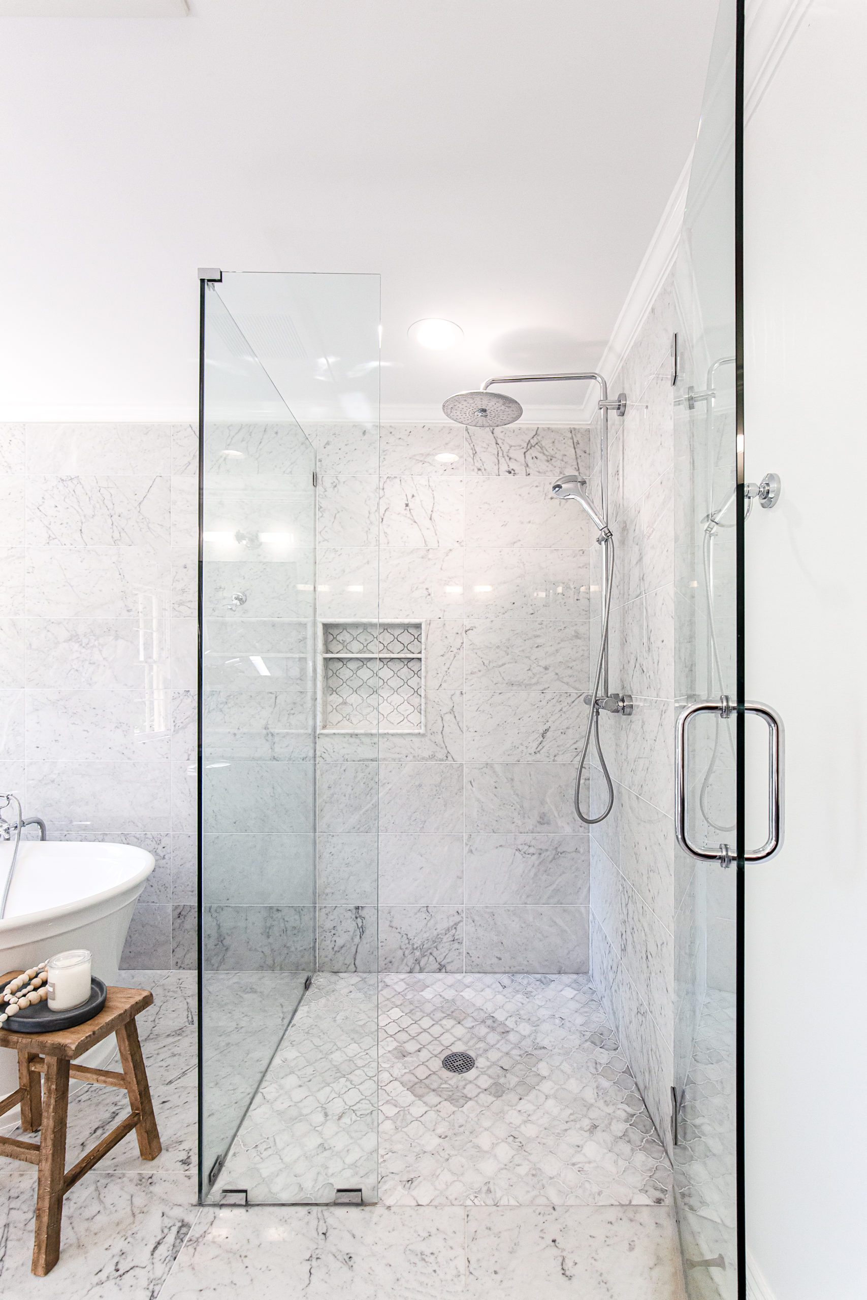
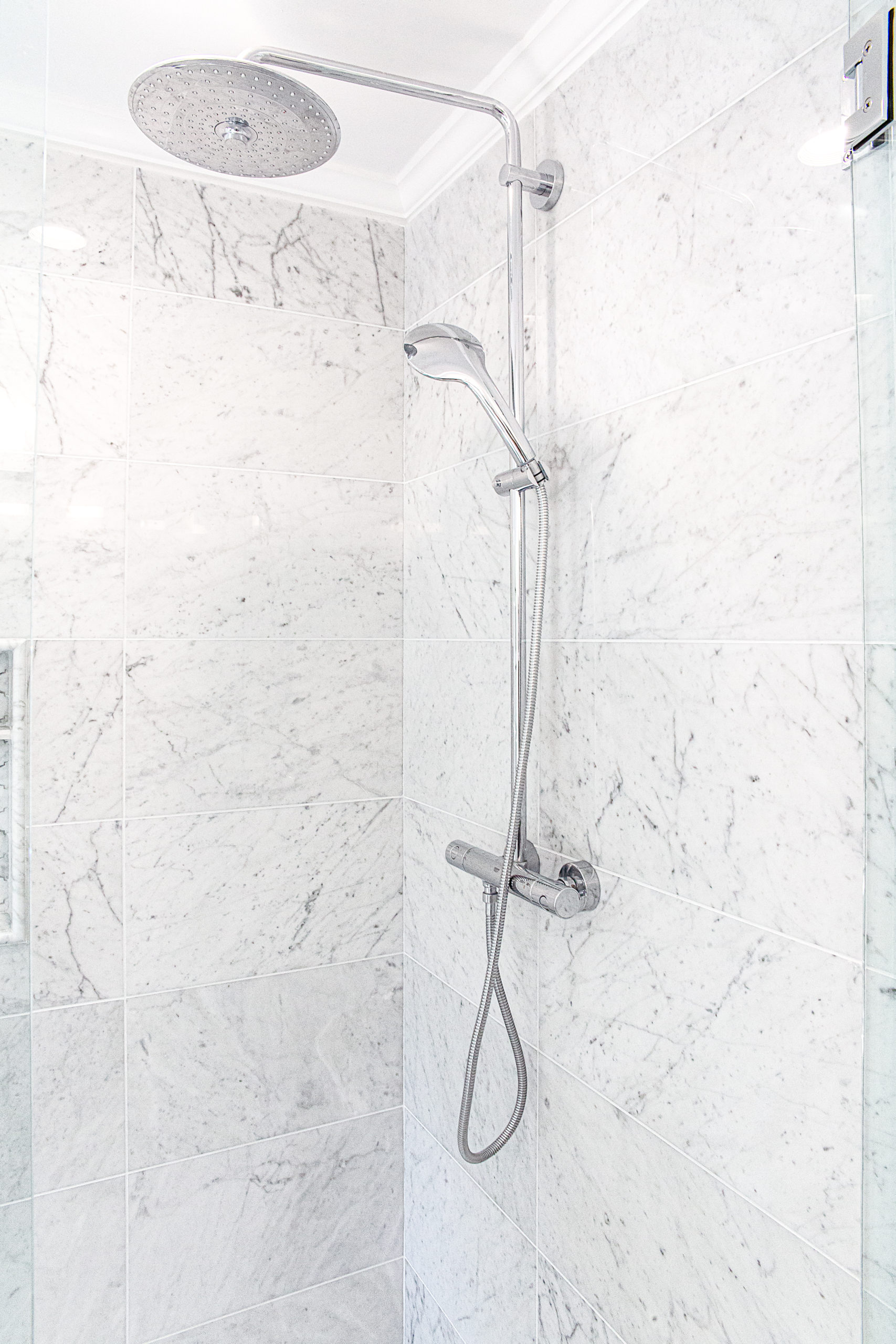
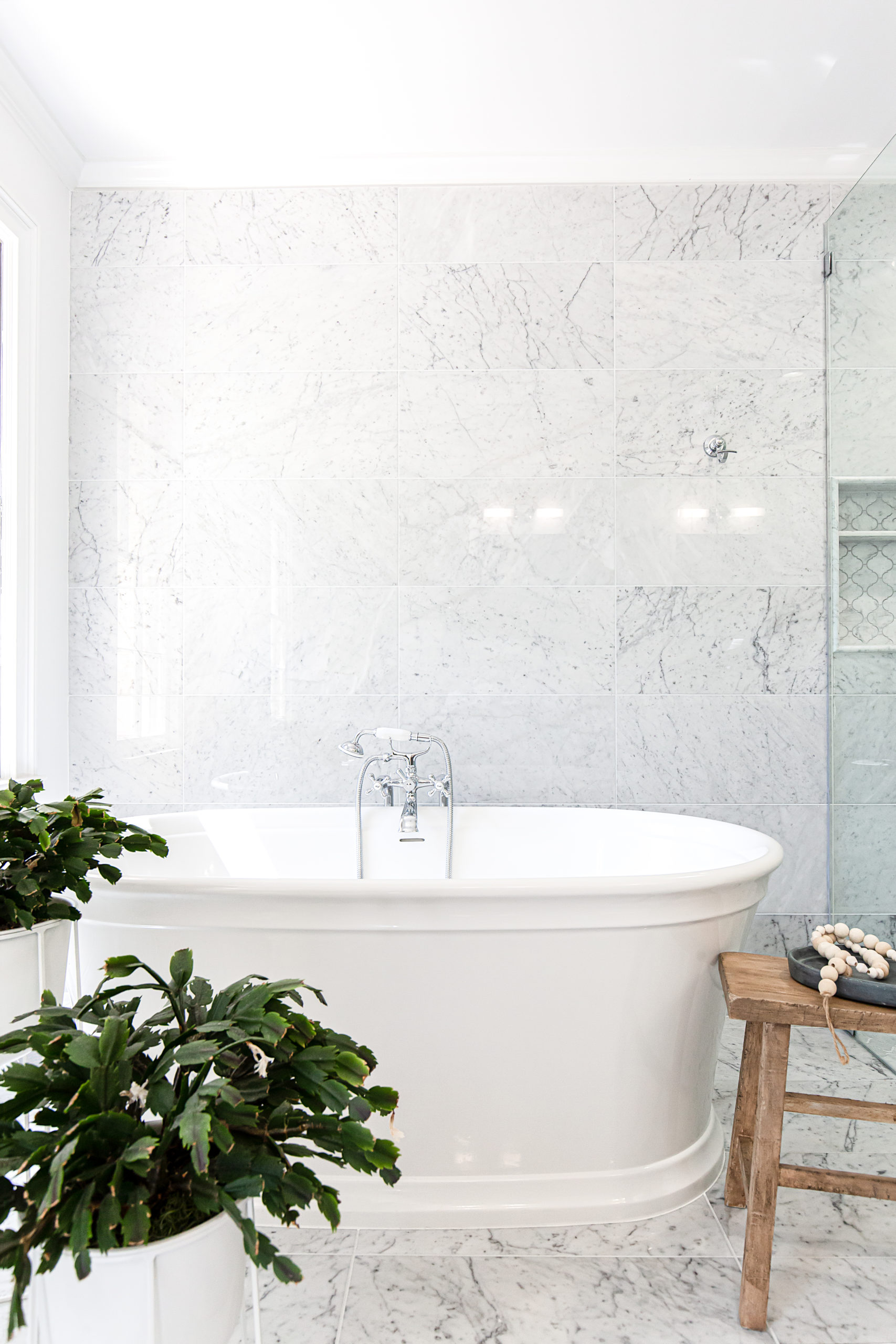
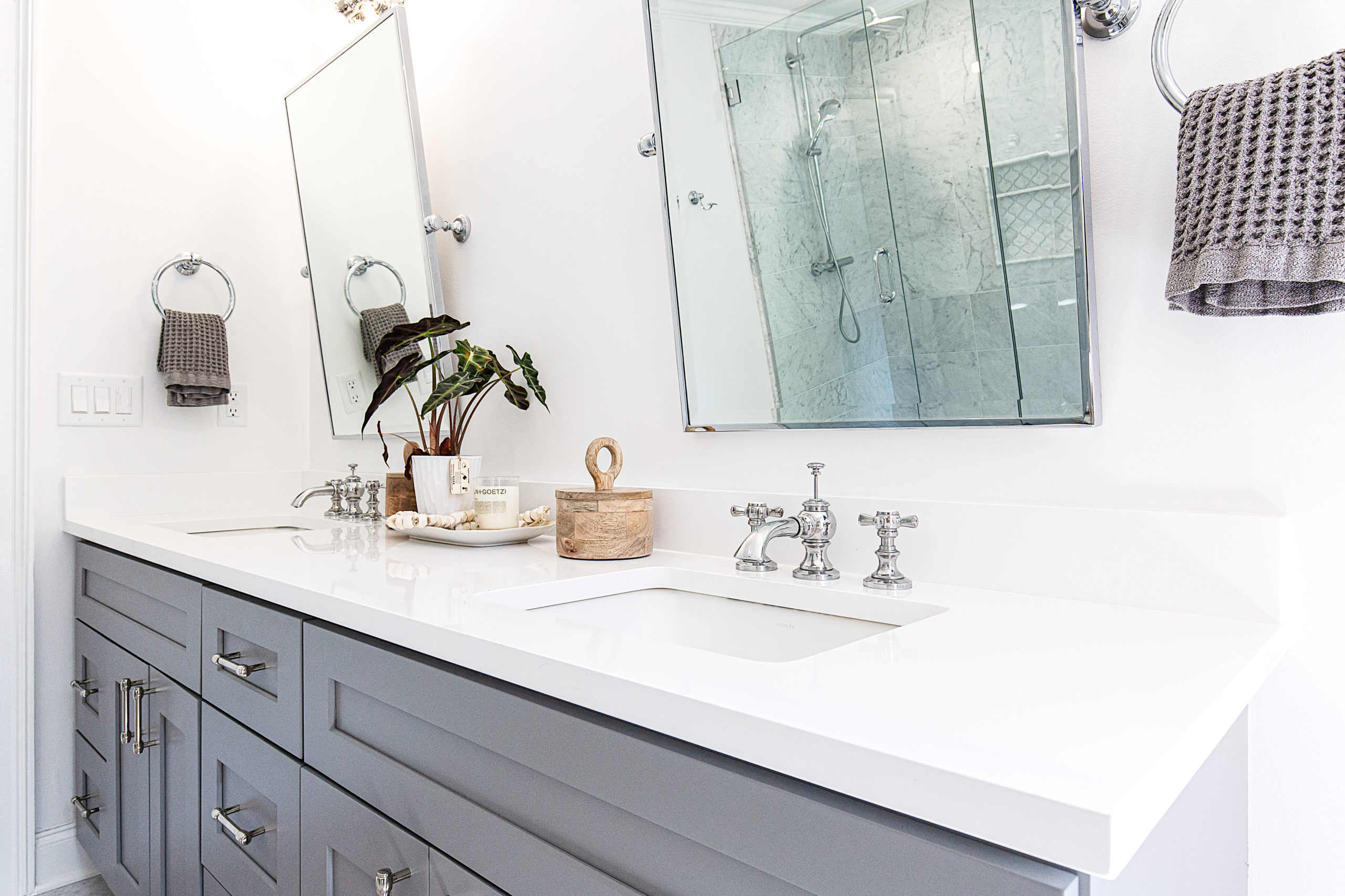
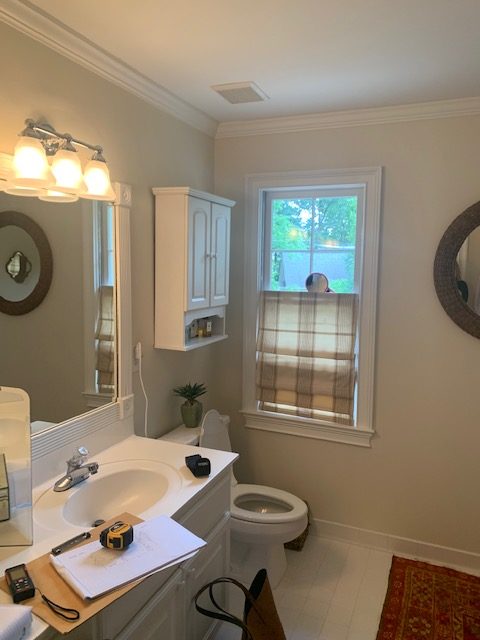
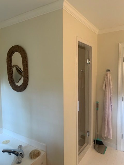
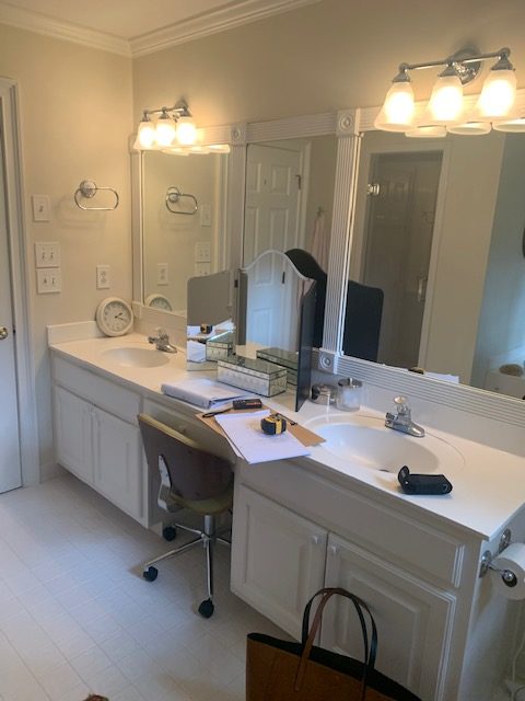
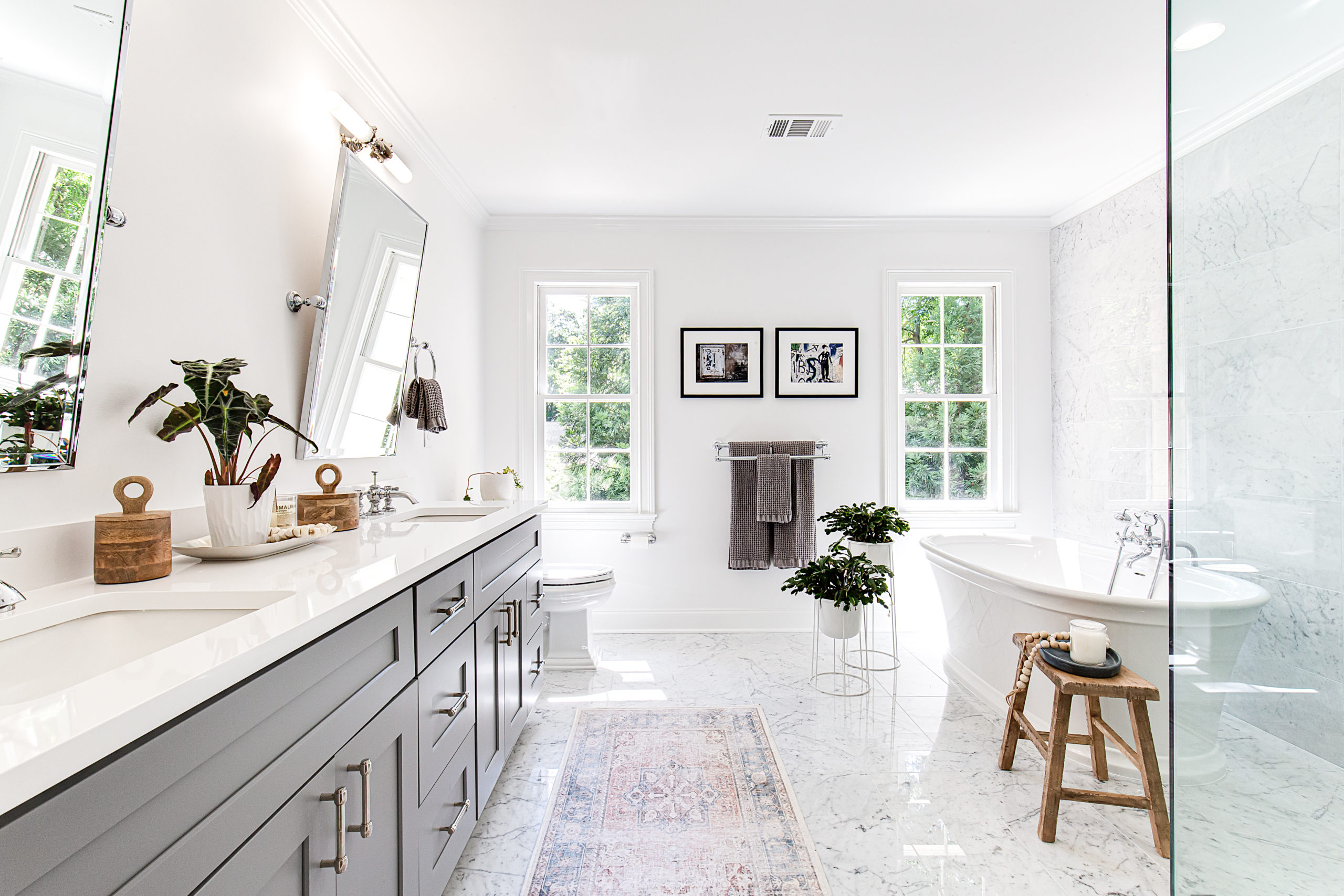
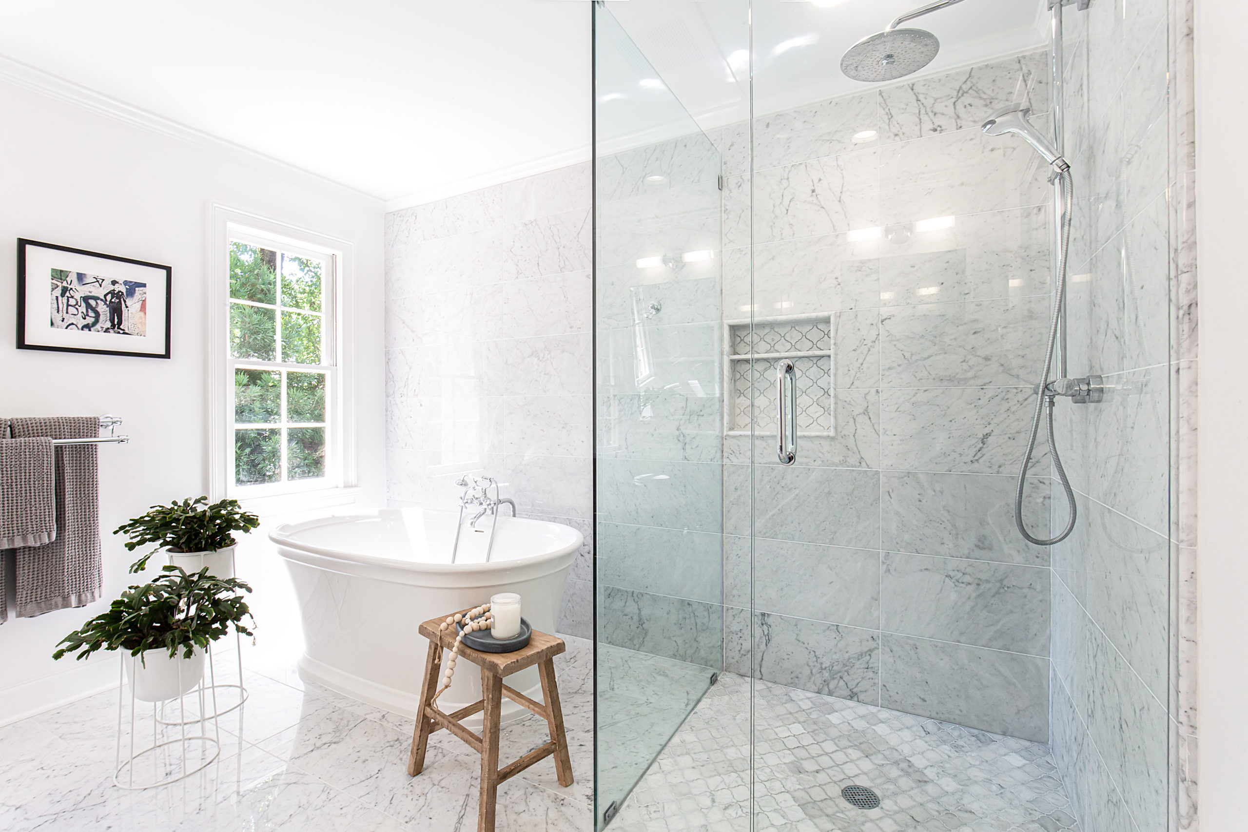
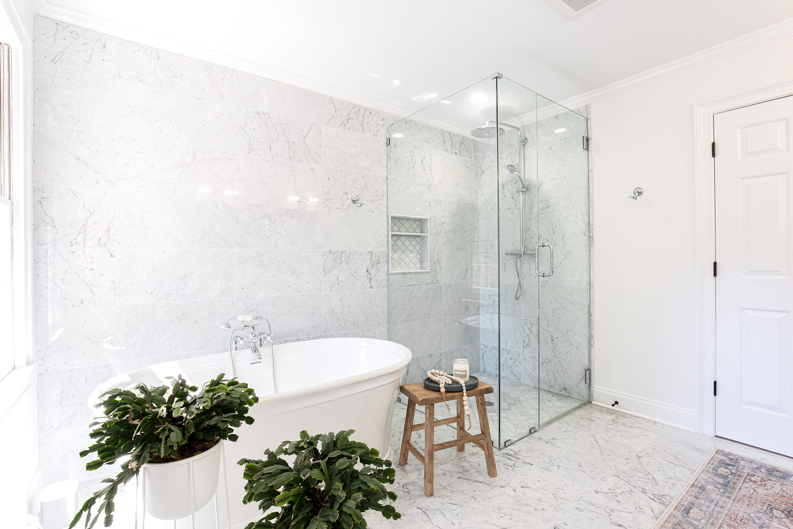
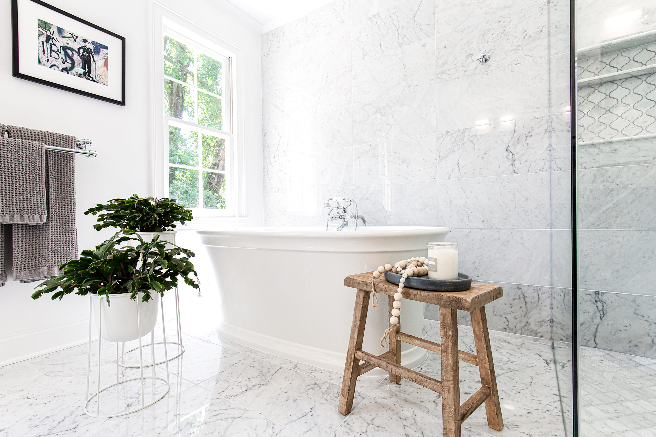
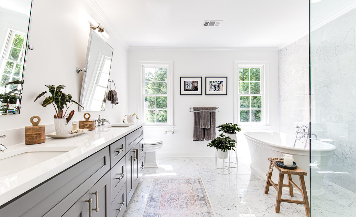
The current master bath was dark and dated, and felt small. By opting to use a simple marble tile on the floor and continued the tile up the shower walls to create a seamless curated look.
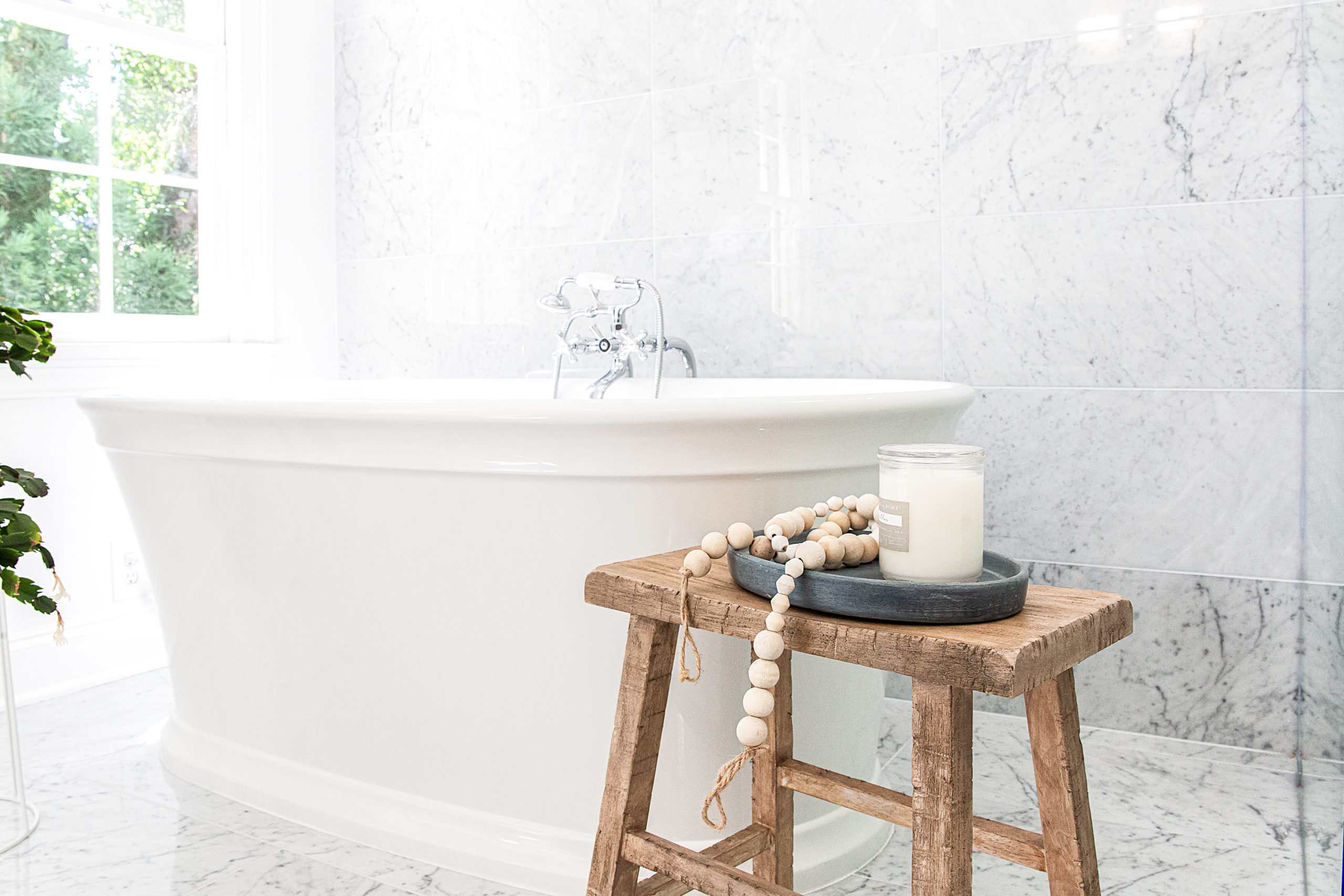
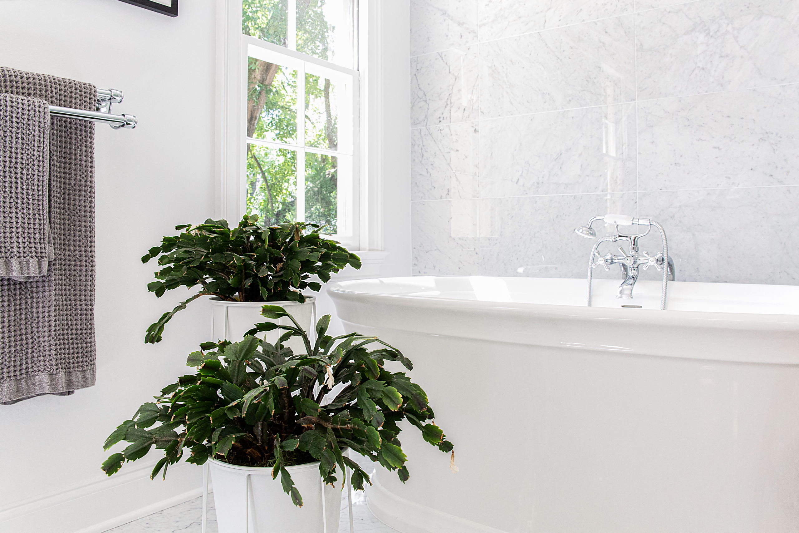
The old clunky shower enclosure was replaced with frameless glass to help create the illusion of a large and bright space. The polished nickel hardware and faucets added an elegant and classic touch to the space.
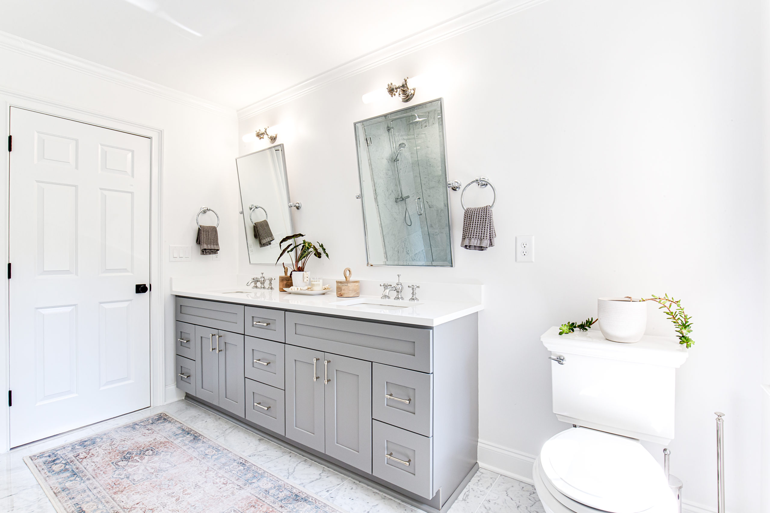
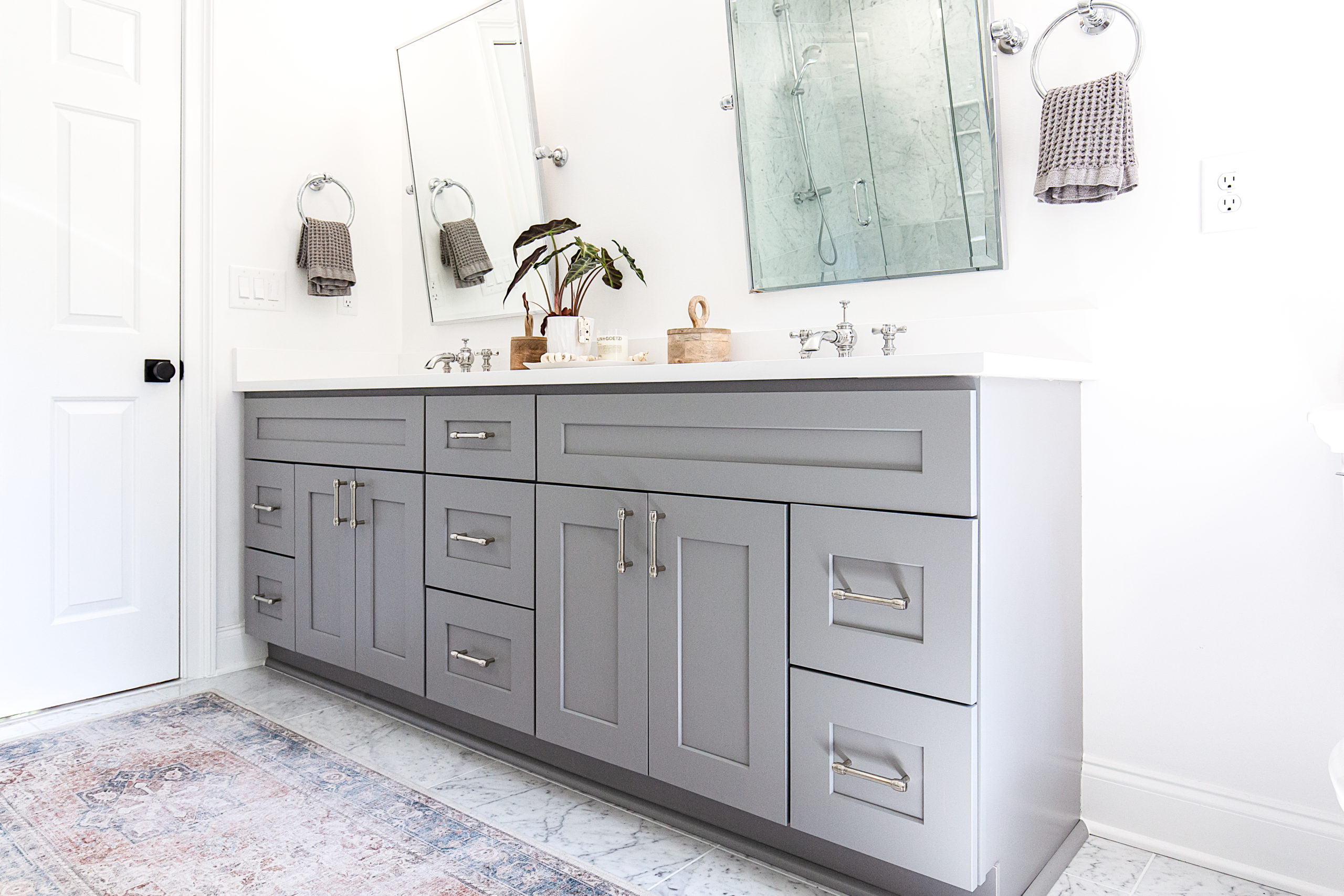
For the cabinetry we continued the soft gray look with a beautiful simple gray shaker but mixed with an elegant polished nickel hardware and soft white quartz countertop.
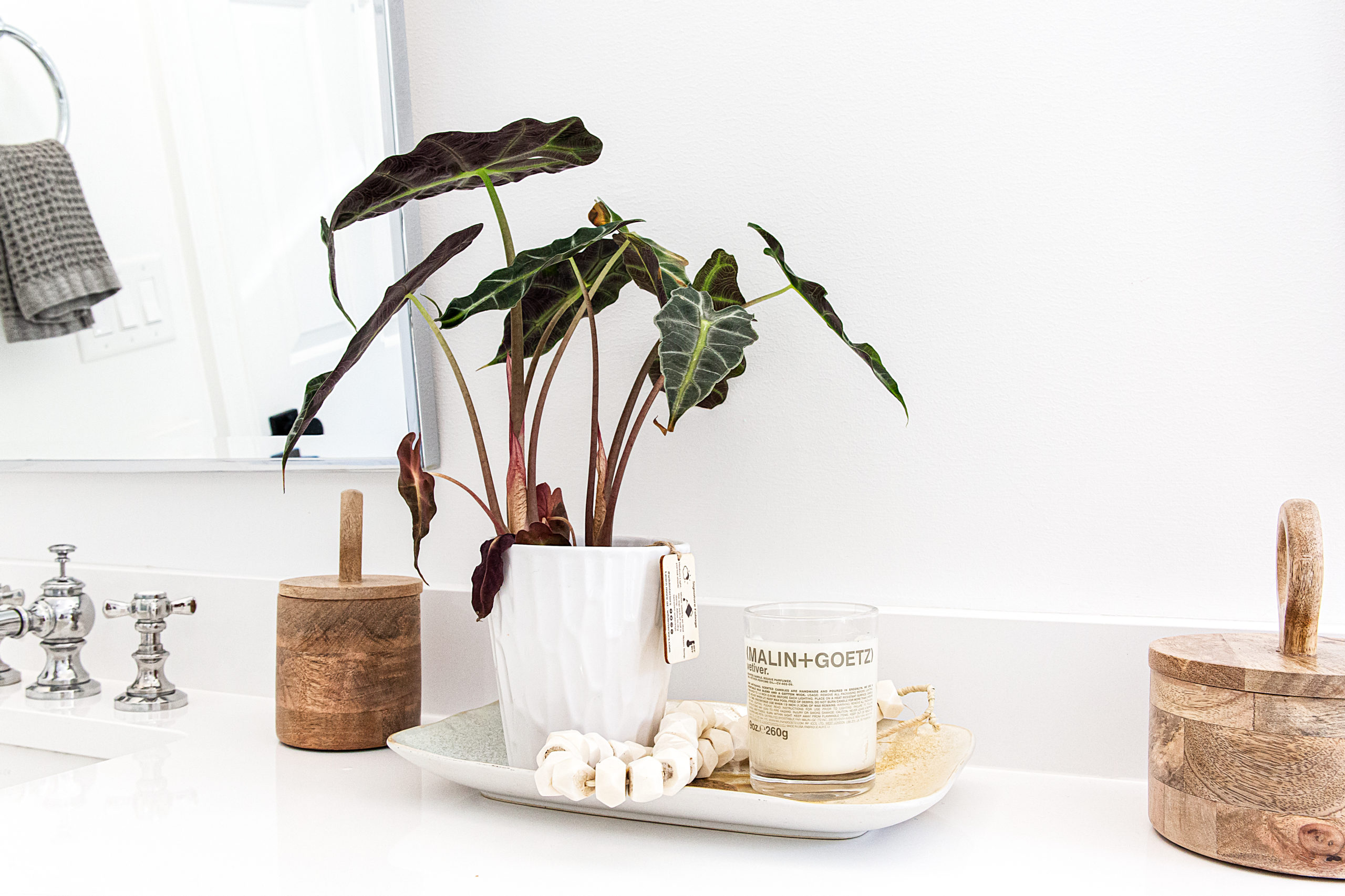
To help break up the monotony of the gray and white, pops of green foliage and wood canisters to bring in texture. The beautiful runner helps anchor the space and bring dimension to the space.
Here are the before pictures showing the dark and cramped space.
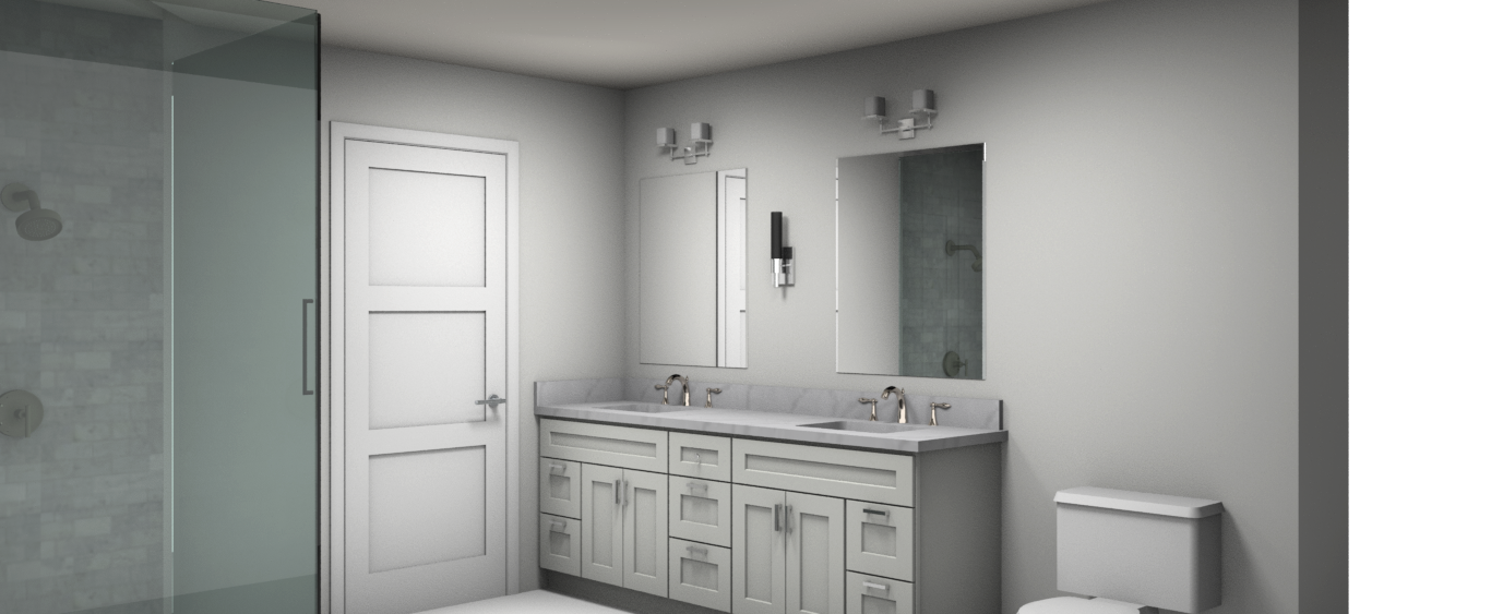
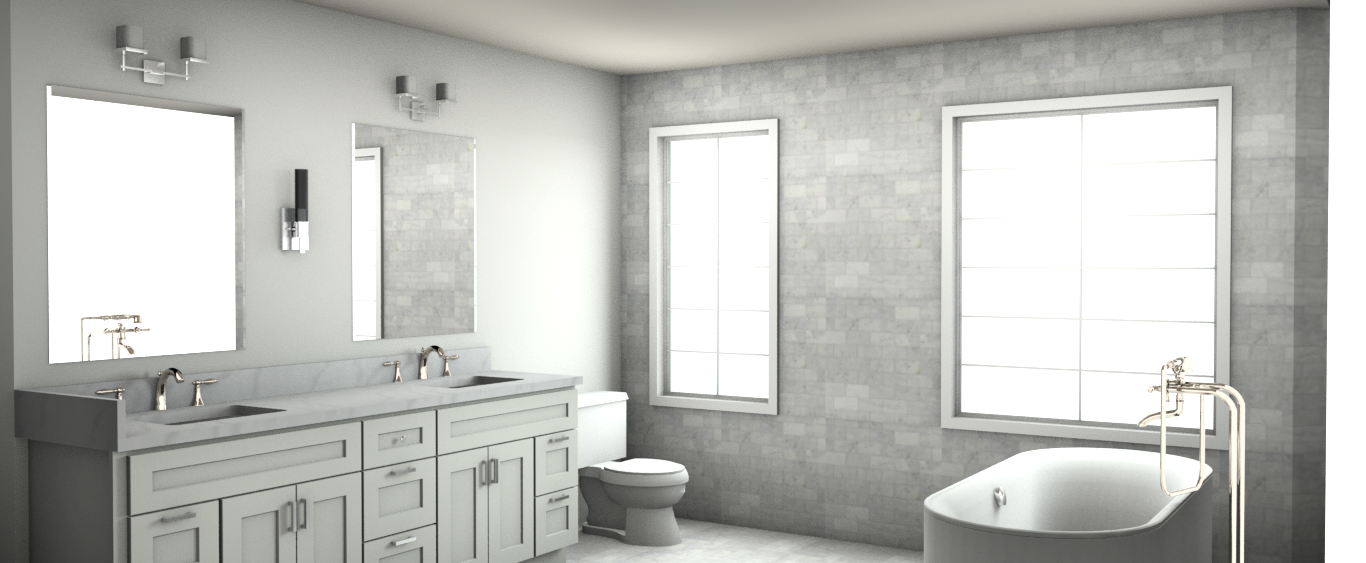
Here are the renderings of the proposed space
For the boy’s bath we opted for a similar palette.
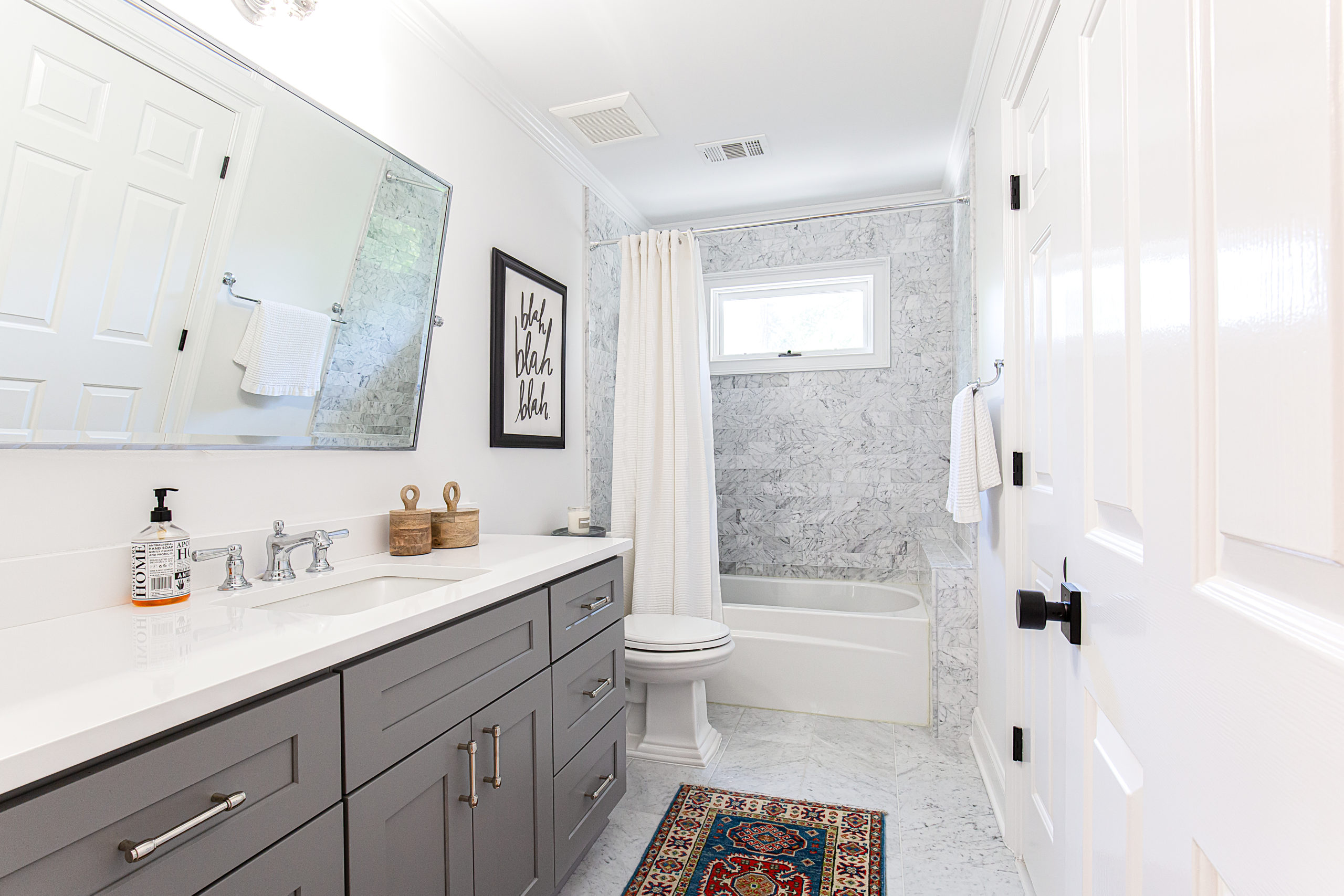
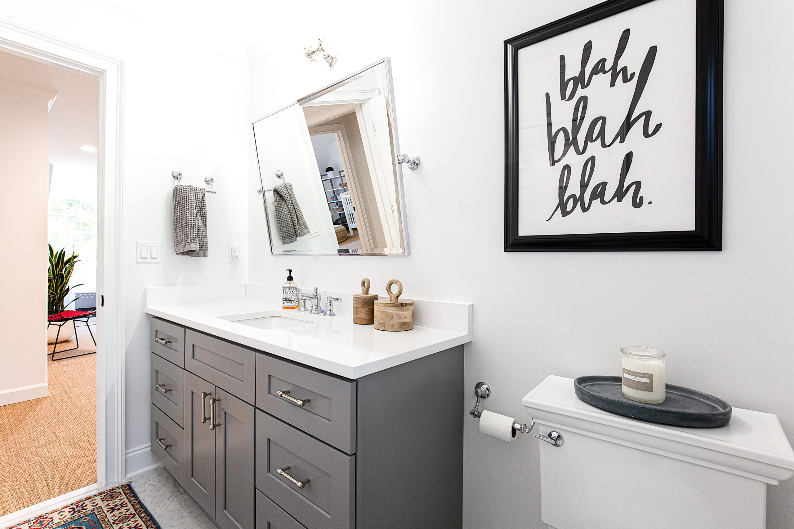
Here was the space before:
Scroll through below to see all the photos of these beautiful bathrooms
Design by: Brittany Varela | Haggard Home
