When looking for their new house for their growing family our clients had one thing on their mind: location. As a commercial designer herself, she knew the interior could be renovated but she could not change the location. After the first house fell through they found this hidden gem, and knew instantly it was “the one”.
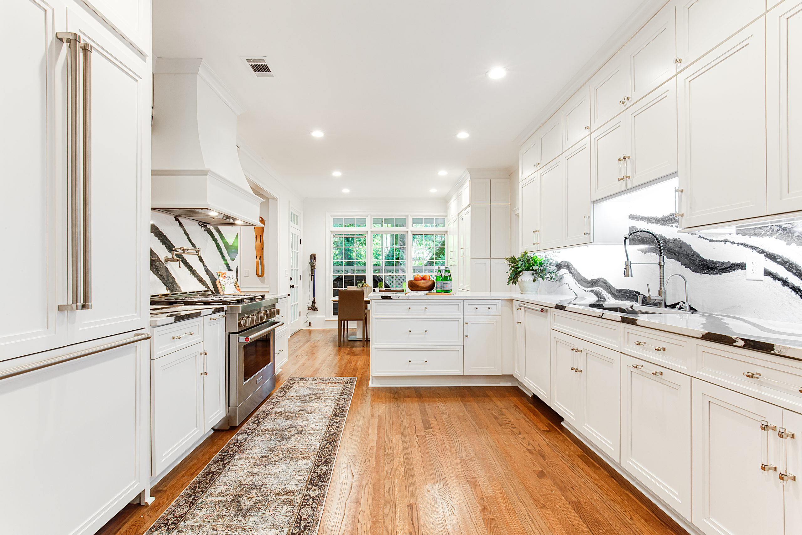
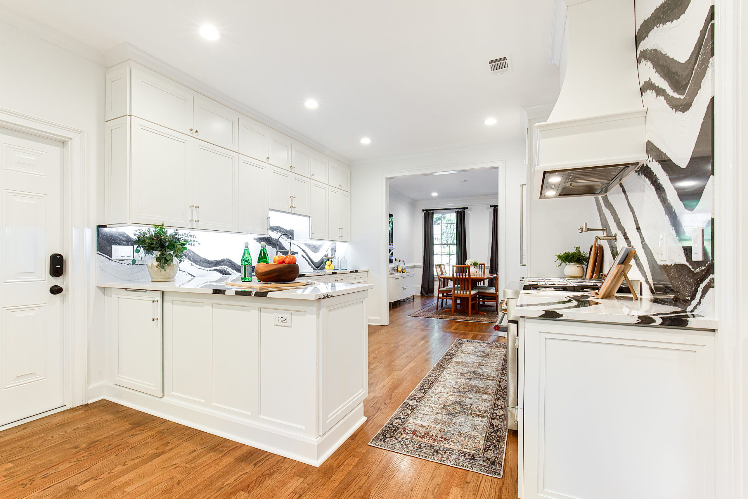
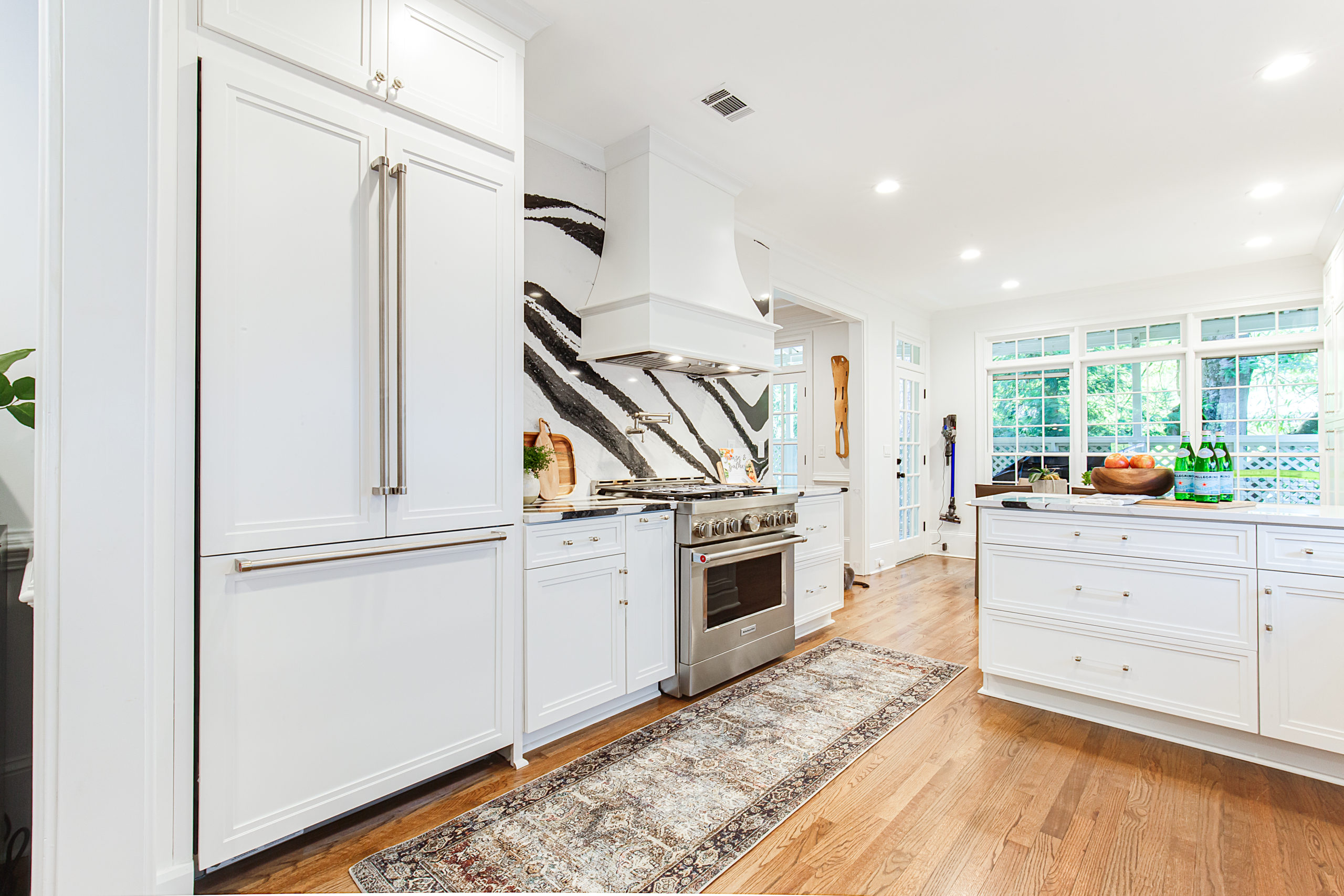
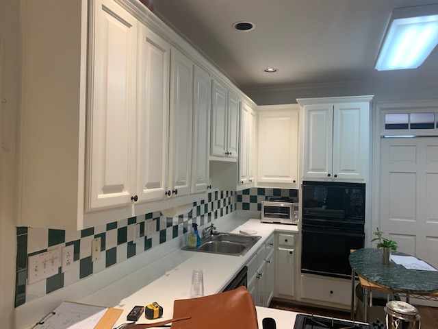
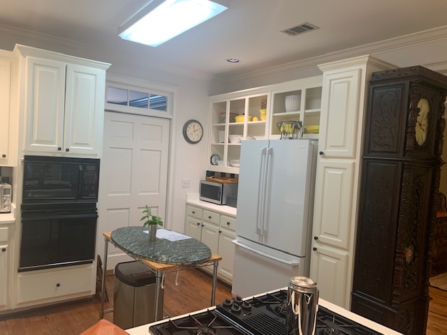
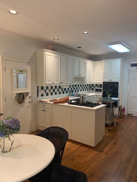
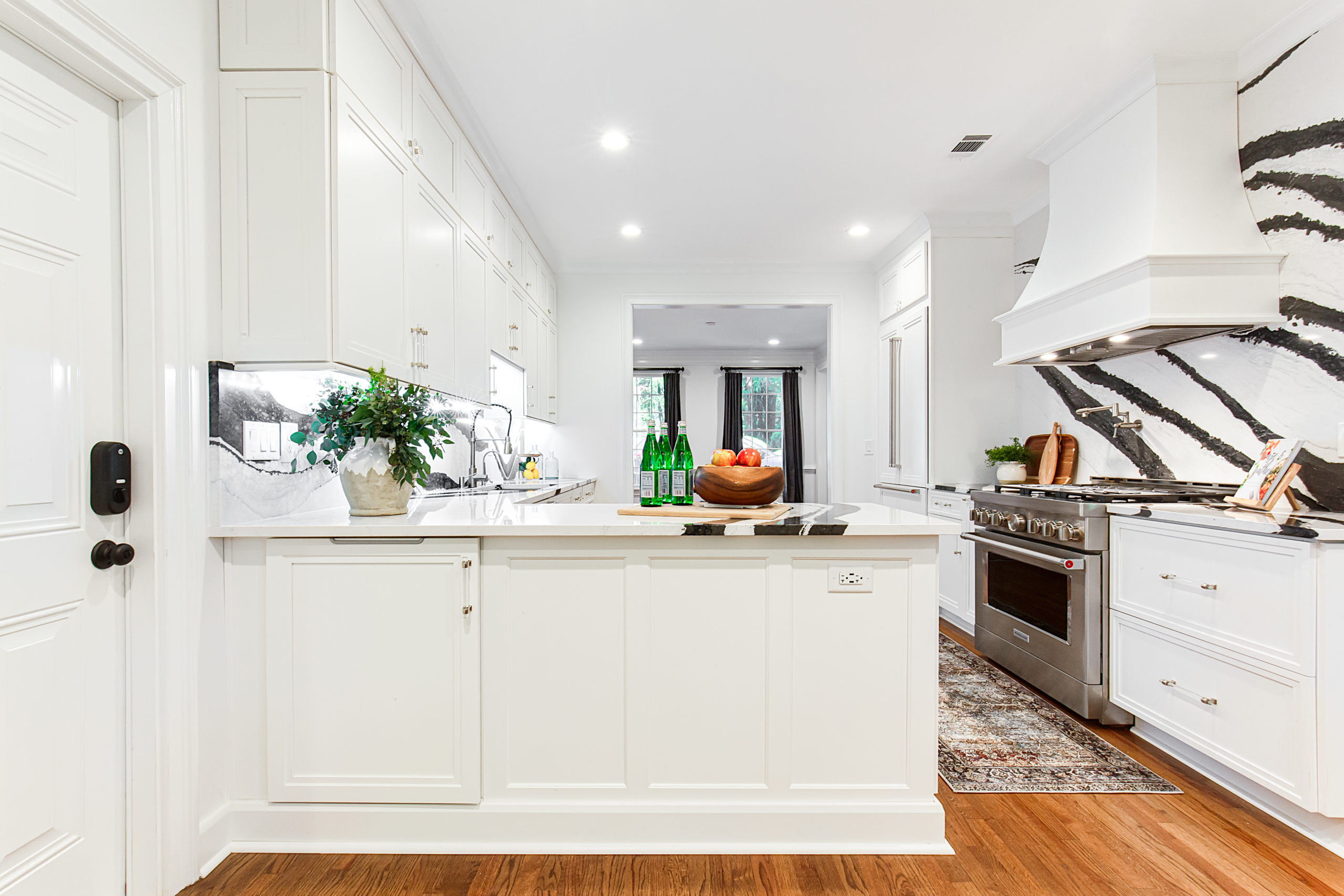
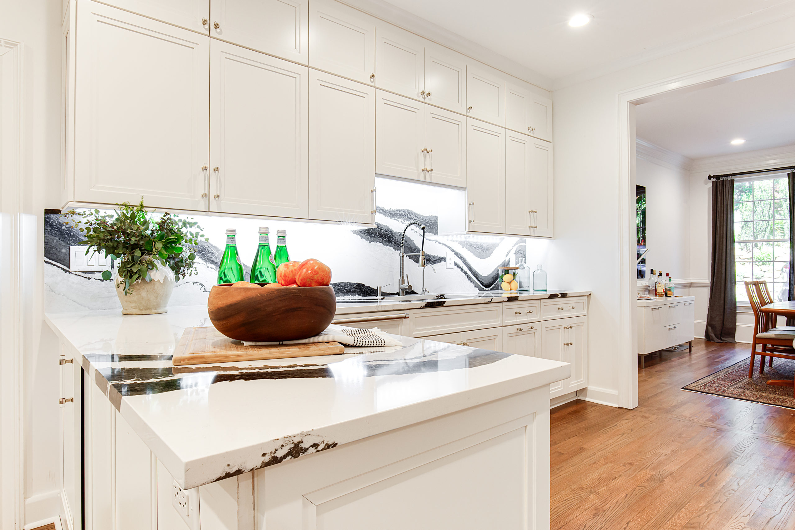
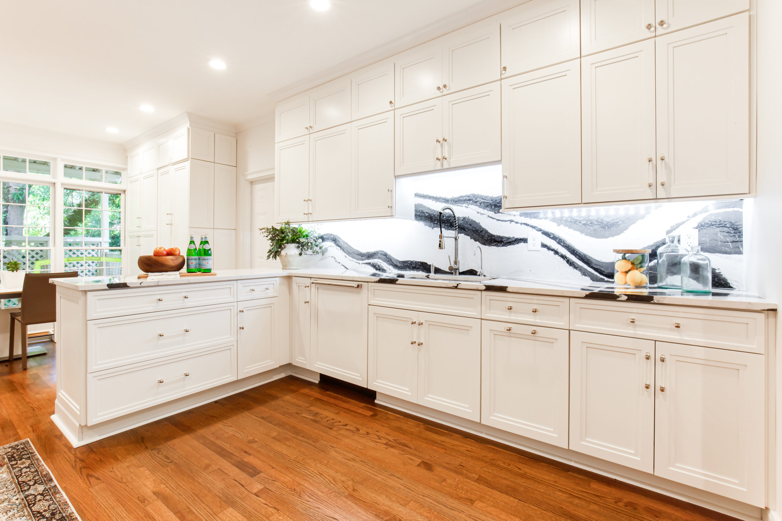
The kitchen was very dated, but by widening the existing doorways and keeping the overall footprint mostly the same the kitchen looks completely different.
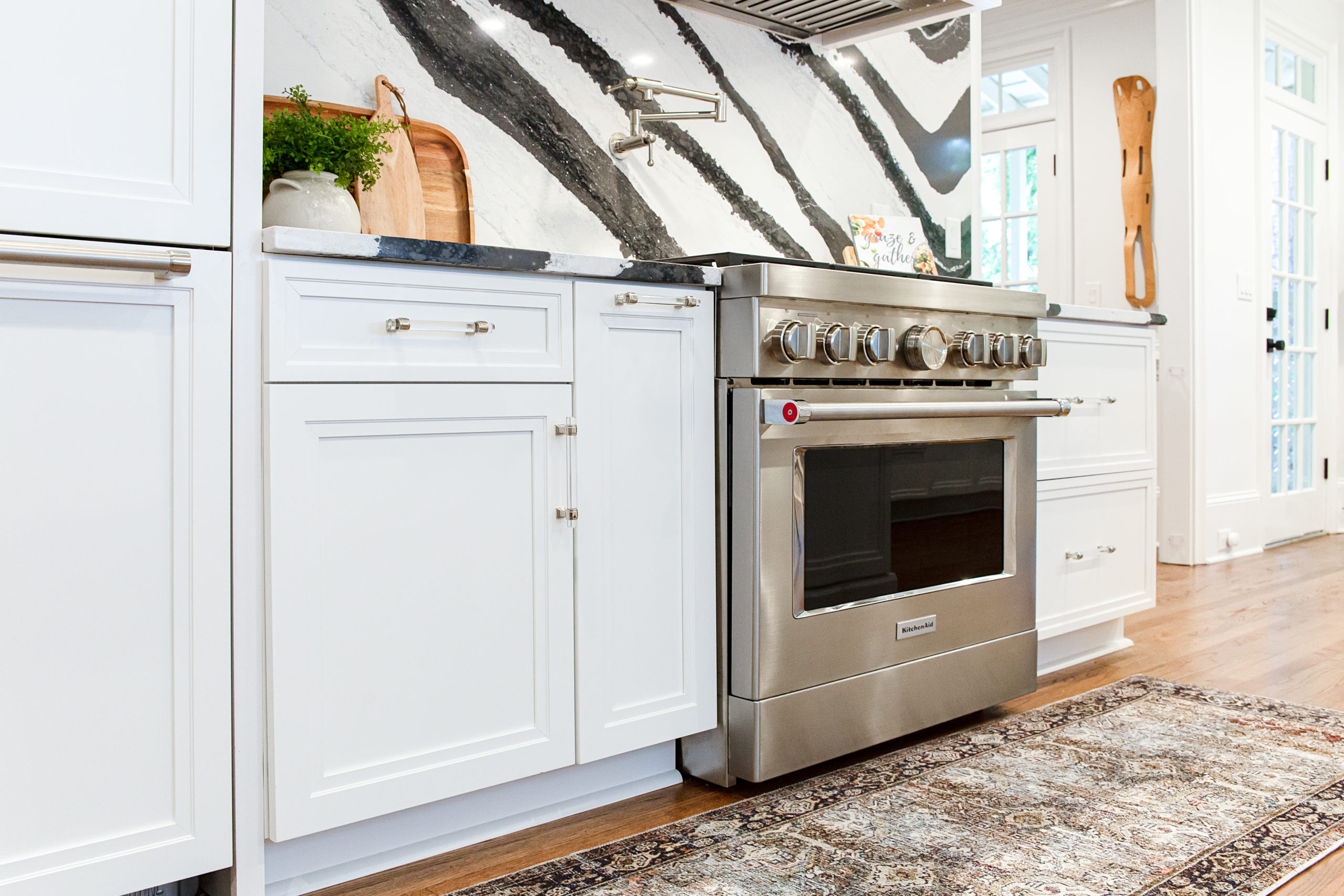
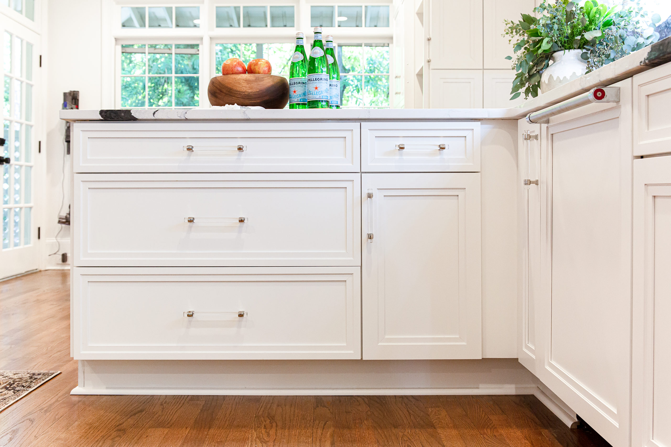
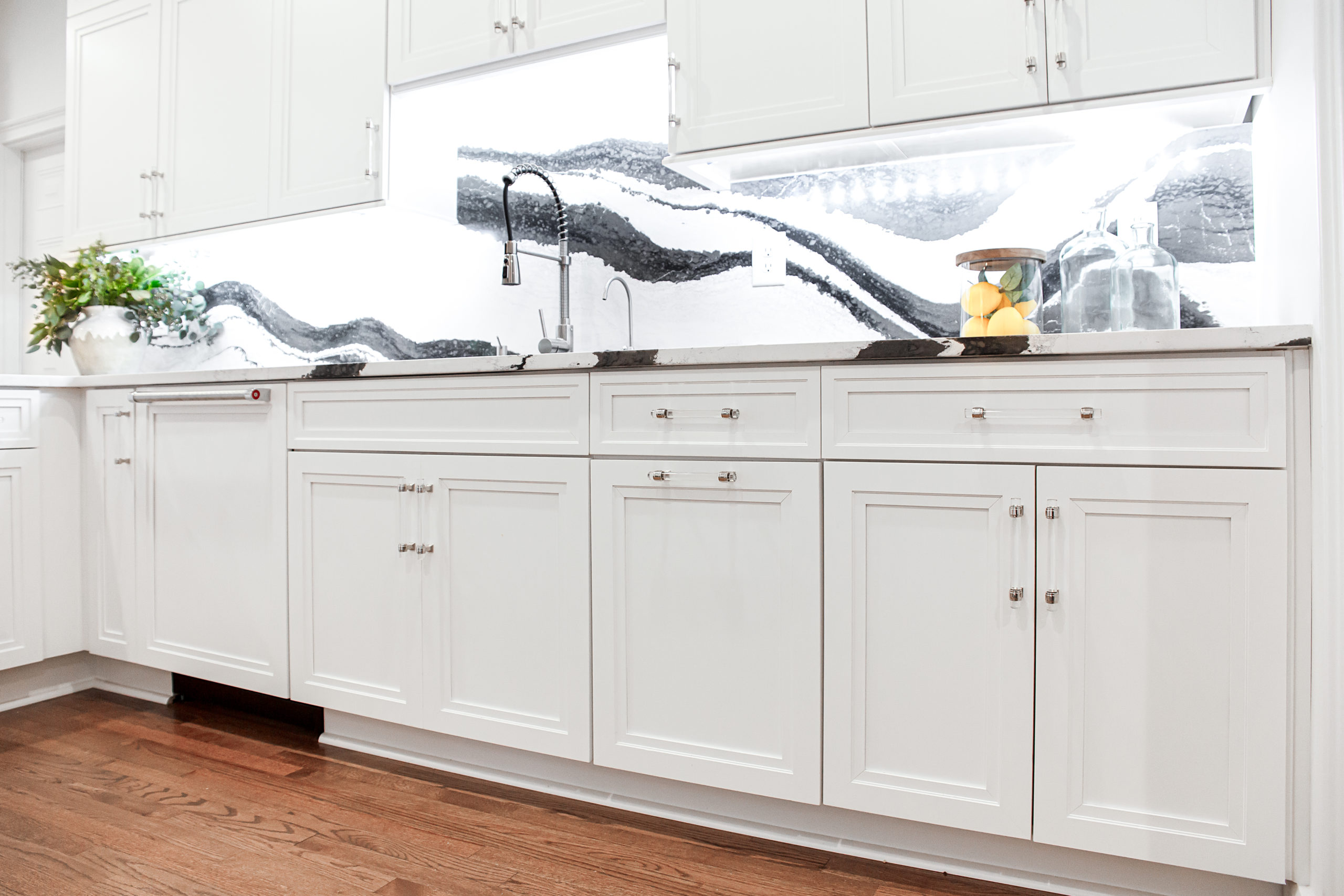
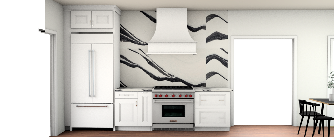
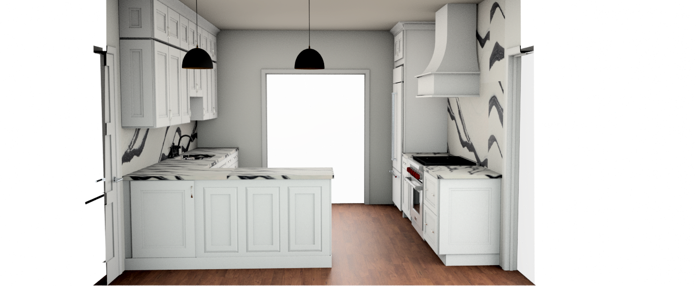
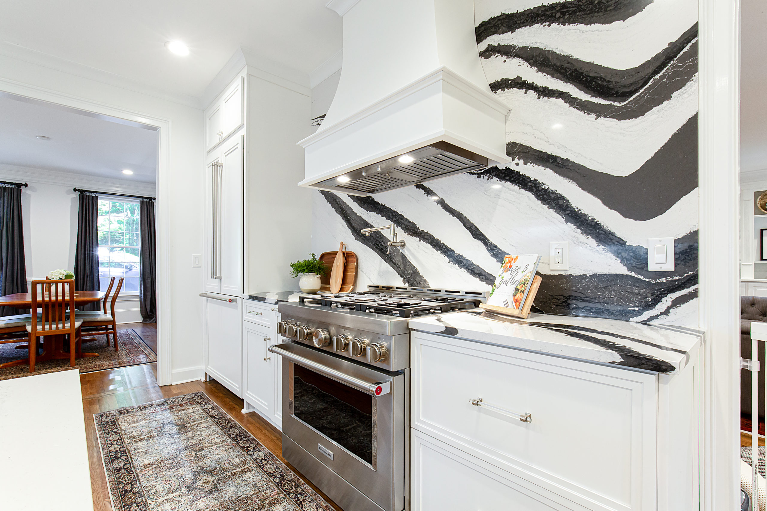
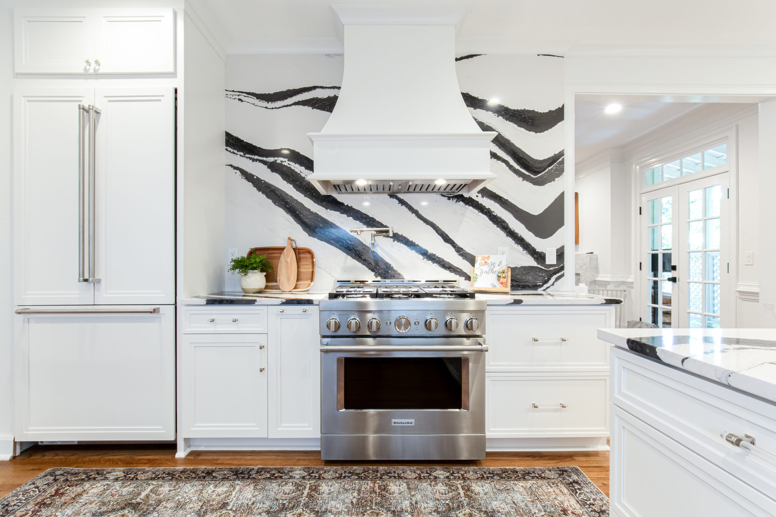
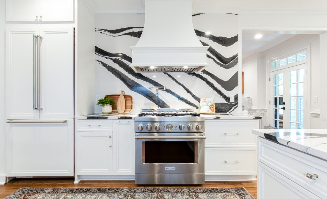
The range was moved and become with focal point with the dramatic Cambria full-height backsplash. The crisp white cabinets mixed with the bold quartz countertop elevated the space while the acrylic pulls brought an unexpected softness to the design.
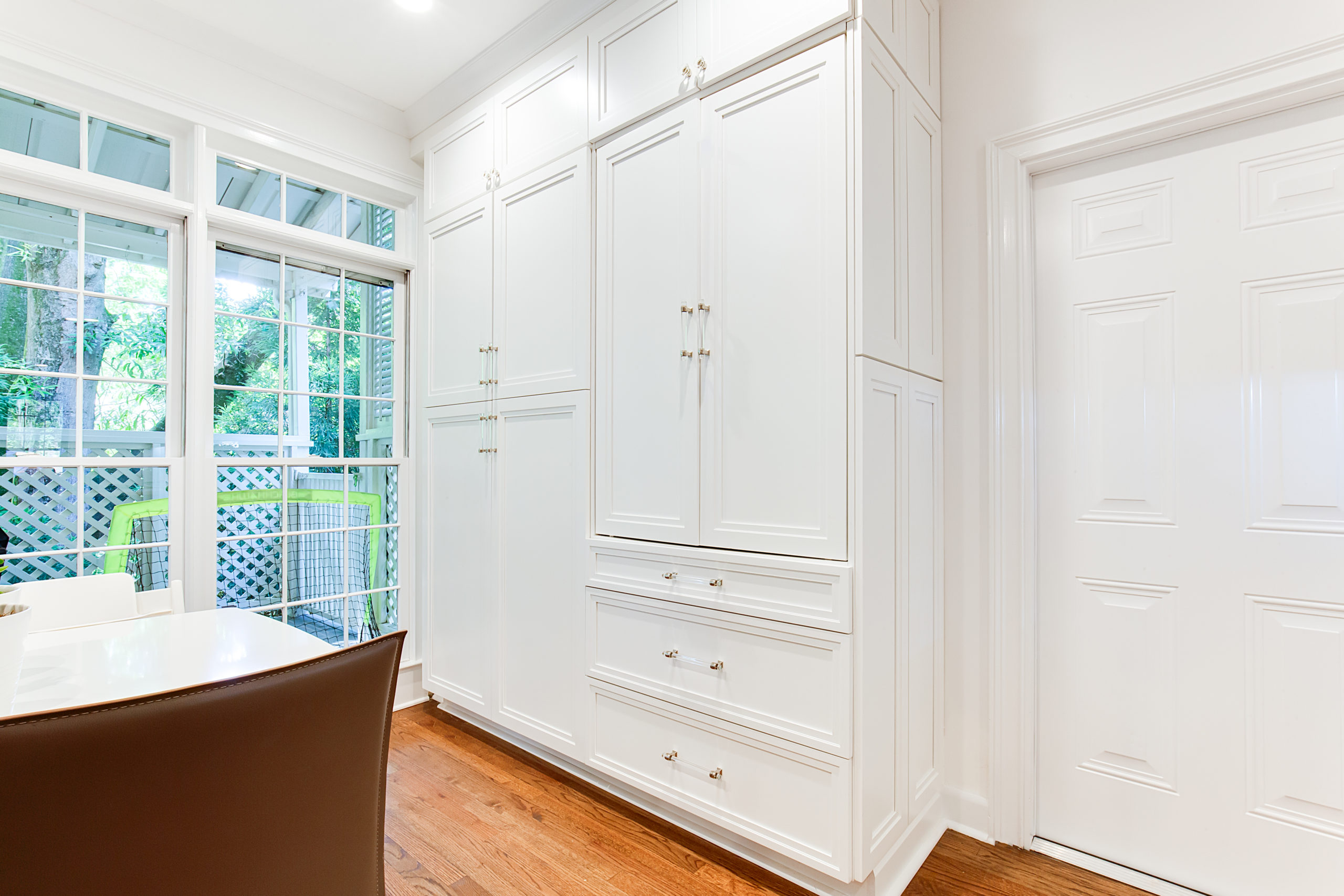
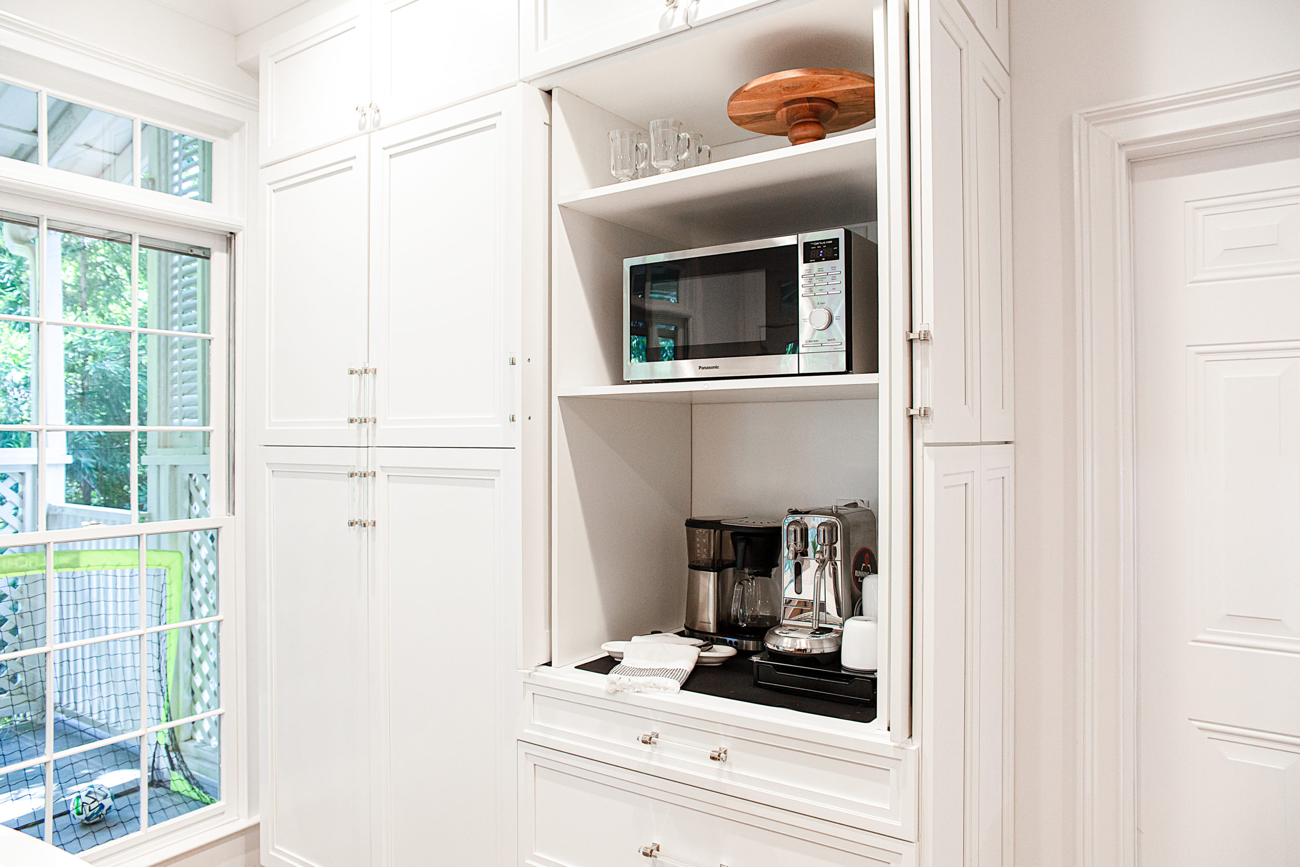
The built-in coffee bar with pocket doors was the perfect way to keep appliances off the counter.
While the overall space of the kitchen did not change it feels larger with the bright white cabinets.
Here are the before pictures showing the dark and cramped space.
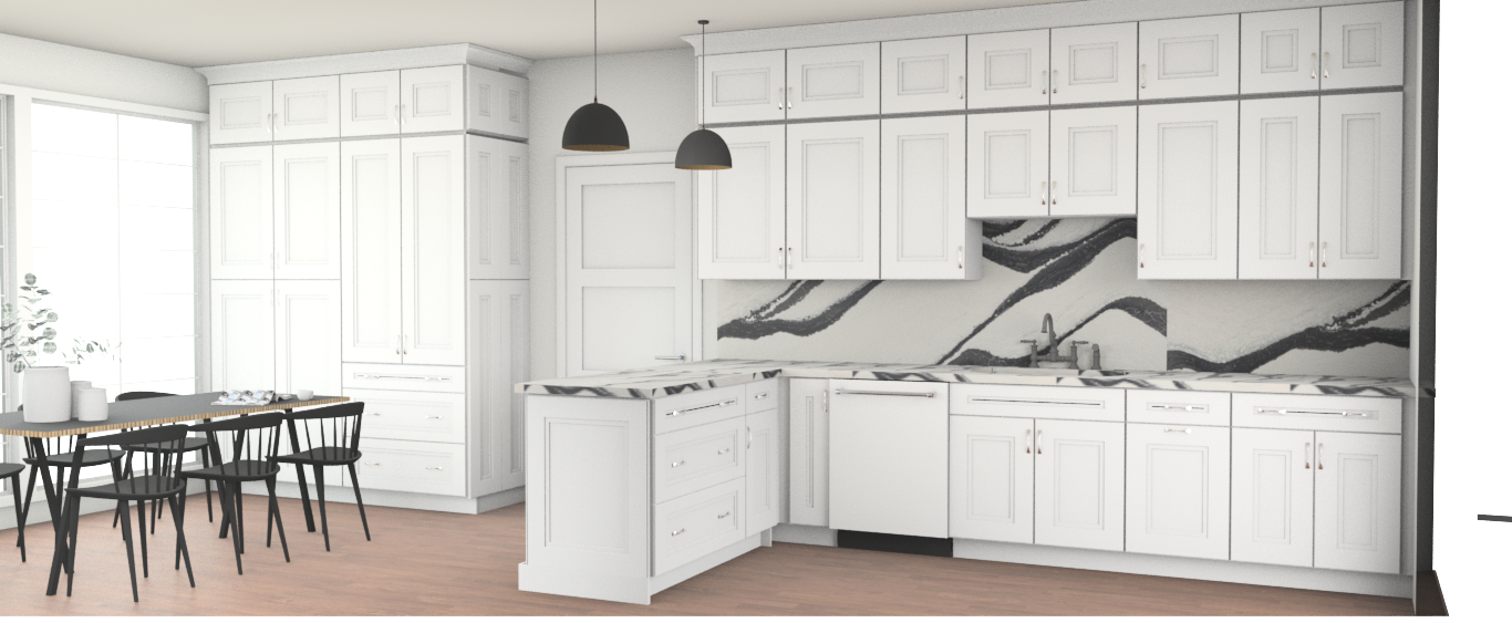
Here are the renderings of the proposed space
Be sure to check out part 2 with the master bath and boy’s bath next week.
Scroll through below to see all the photos of this beautiful kitchen.

